If you didn’t catch my last post (read it here), you won’t know that over this Christmas period, I won’t be blogging as much, so there will only be a post up every Sunday (not for long though, just until the new year!). So, seeing as series posts go up on a Sunday, I have a new Scrap Social post! You guys love them, you seriously do! Enjoy…
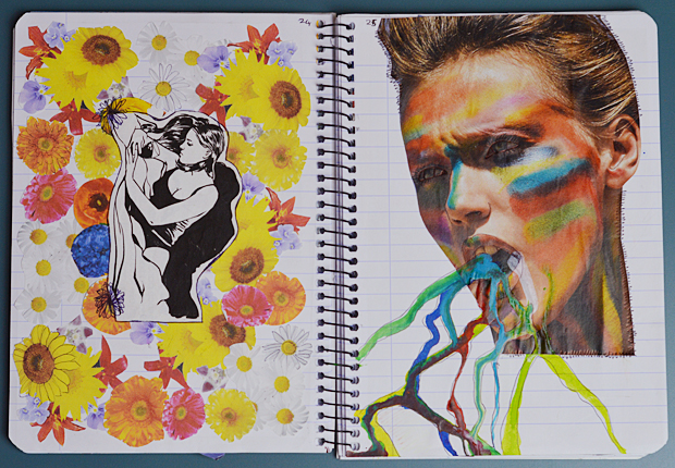
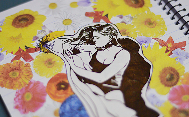
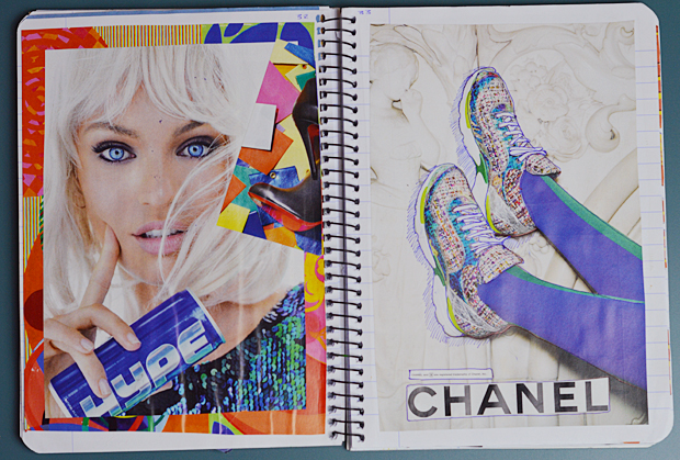
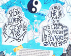
So as you can tell from the title of this post, I’ve been (accidentally) matching pages and creating themes… for some odd reason! This is a big example, all the colours match! I actually printed out things for this page for the first time. I just really liked the whole look of the left page. It reminds me of some 90’s teen movie or something. The illustration was from a magazine, and I’m so glad I cut it out! The other page is also really random… my mum was also scrapbooking at the time, so I borrowed some of her inks to add to this random lady covered in face paint. It now looks like she is puking paint, but I really like the outcome looking at it now! What d’ya think? Yay or Nay to ink?
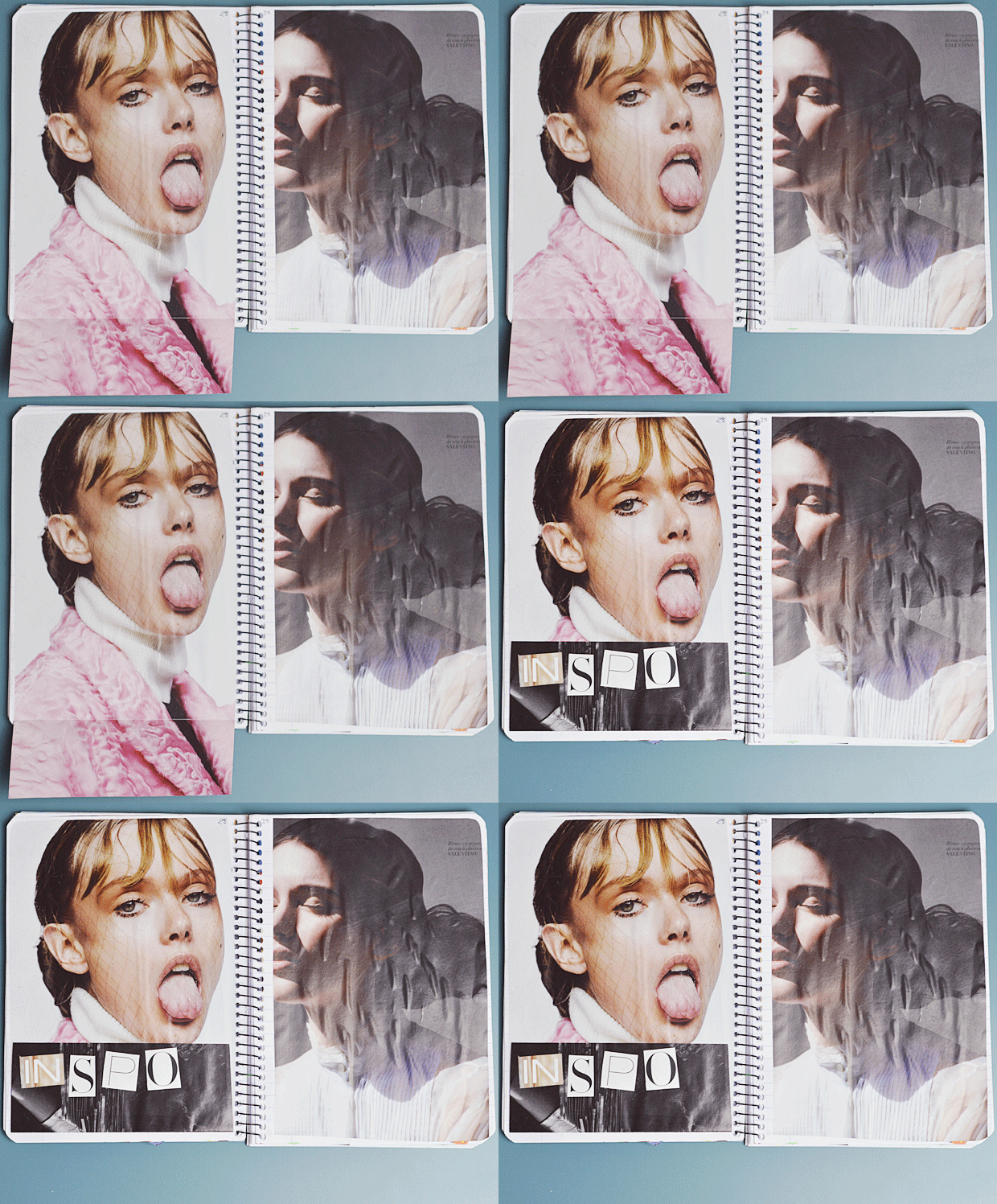
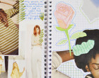
Do excuse the awful air bubbles in that GIF! I hate working with thin floppy magazines… ew! Anyway… again these four pages all match in some way?! I love the idea I had for the top 2 pages. They’re like a bunch of pieces from your mum’s drawer… classic books, perfumes, hand creams from years ago, and pressed flowers. The colours all match and they have a really nice fresh aesthetic to them. The bottom page was when I was looking for blog photography inspiration. Fashion editorials have been my biggest ‘INSPO’ so, I decided to pop them in! Obviously a GIF was obligatory with the whole flip down business.
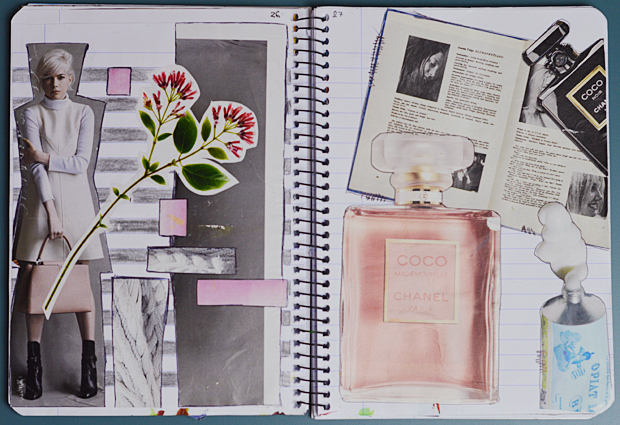
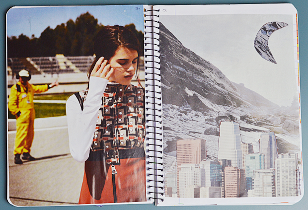
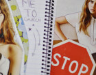
Okay these pages definitely don’t match altogether, but in pairs they do! The top two are again, blog inspiration, so just some cut outs and full pages. The bottom two are actually some of my favourites! I love the colours and simplicity of each page. The girl in the left page has such a strong face and character, I couldn’t not use her! My mum’s old scrapbook had similar style pages, so it was a big inspiration for when I put it together (let me know if you want to see her old one in a Guest Scrap Social!). The right page is basically a shrine for Chanel… aw, so pretty. I would probably die with excitement if those trainers were mine… one day, one day!
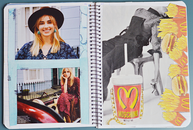
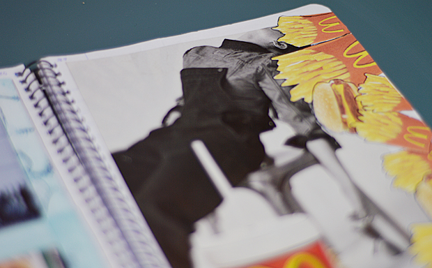
Ah two of my favourite things… Suki Waterhouse and McDonalds… I jest, I jest! Recently though, Suki Waterhouse has come to my attention and has become my new girl crush. Ergh, her hair, her style… basically just… SUKI! So I printed out some blue turquoise stone and bordered it around some shots of her. The final page was just simply added because of the awesome black and white editorial, and the Moschino bag… another sigh because I genuinely want that bag, SO. MUCH. Again, I printed out some McDonalds food, and stuck it down, outlining them with my trusty biro pen. I really like the outcome of this page, I think I might try this method again!
Let me know what you think of this update! There will sure be another Scrap Social post sometime soon, and maybe even another Guest Scrap Social, so stay tuned.
