Tolly Dolly Posh Fashion
Tolmeia Gregory New Site
Browsing Tag

magazine clippings

Scrap Social #6 – The Last Few Pages

By December 15, 2015 Scrap Social

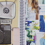
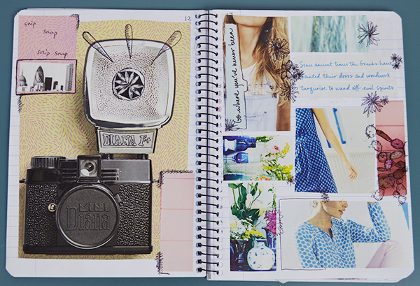
Look who’s back-back-back again! Both myself and our good little friend Scrap Social! I totally forgot of this series over the past few months so I’m back and I hope to still be doing it in the New Year! This is actually a showcase of the last few pages of this scrapbook. You’ll probably be mad at me for this but this scrapbook was finished in March… *gulps* so I will definitely have a new one to show you after this… don’t worry!

How To Make A Scrapbook - Scrap Social - Fashion Inspiration

How To Make A Scrapbook - Scrap Social - Fashion Inspiration

How To Make A Scrapbook - Scrap Social - Fashion Inspiration

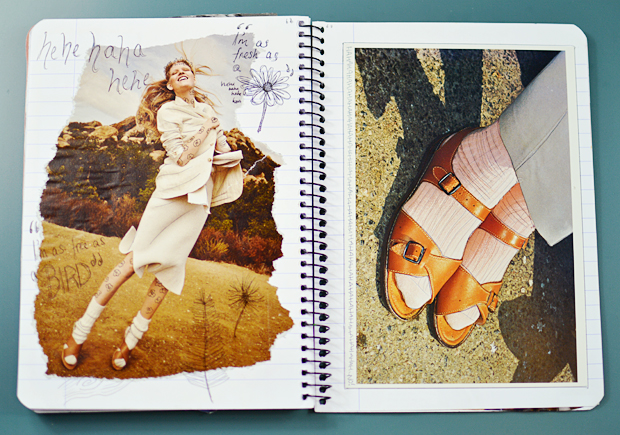
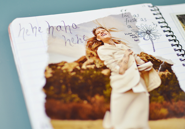
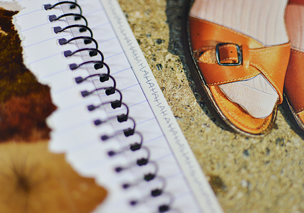
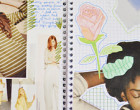
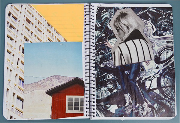
These pages unintentionally matched… I just suddenly realised after finishing them up that the model on the left page, had very similar sandals on to the ones from the postcard on the right. I loved the free spirit of the editorial piece on the left, so I added some fun little doodles around it… which sort of adds a contrast to the rough edges that I decided on to go with the natural backdrop and colour palette. To match the doodles, I added a border of ‘HAHAHAHAHA’ to the edge of the postcard (this one was featured in my Scrap Social Essentials post actually!), and some extra outlining as per usual. I love the colours of this page combo!

How To Make A Scrapbook - Scrap Social - Fashion Inspiration

How To Make A Scrapbook - Scrap Social - Fashion Inspiration

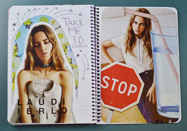
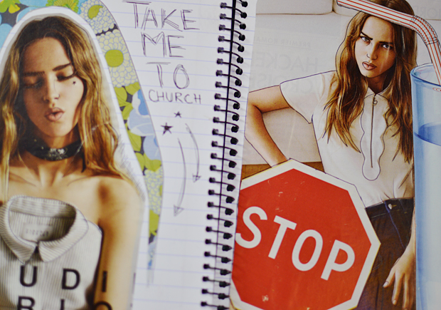
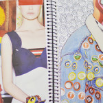
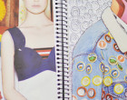
Another page combo with a nice colour palette are these two which I made up from a Claudie Perlot advertorial. I absolutely love the aesthetic it had, so I added a few other elements to it and I’m really happy with the effect. As I mentioned above, as per usual, there is some of my well known outlining again, which I think adds the finish touch. Sometimes pages don’t have to make sense in terms of telling a story, they just make sense in an artistic sense. Matching colours and creating a ‘vibe’ is what is important. Don’t ya’ think? Also – note the Hozier lyrics!

How To Make A Scrapbook - Scrap Social - Fashion Inspiration

How To Make A Scrapbook - Scrap Social - Fashion Inspiration

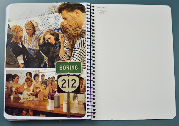
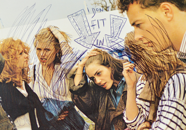
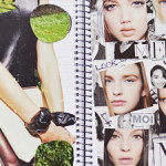
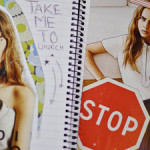
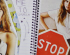
Yes, that is indeed the final page. It’s an odd one, once again using some postcards which have an old/retro vibe to them. Sometimes I genuinely have no idea where I’m going with pages so they end up being really odd and this is a great example. I like it though, it has a nice message to it in a sense, even if the picture has no relevancy to it whatsoever. The bottom postcard I used was kind of weird and gross in some aspects (sloppy hot dogs from what looks like the 90s in a public swimming pool?!) but adding some captions and the BORING sign made it tie in nicely.

It’s actually interesting to compare the first and last page of my scrapbook because they’re so vastly different in colour scheme and style. You can see I stuck to Biro scribbles throughout, but you can definitely notice a change. You can see it for yourself if you like, take a click through this year’s Scrap Social scrapbook!


~ CATCH UP ON #SCRAPSOCIAL ~

So, yup! That’s it 🙂 By the way, in case you missed it, there’s a #MooiEnLiefbyTDP give-away going on ight now! It ends in 2 days so make sure you get entering before it’s too late. Good luck and happy holidays everyone! Speak to you soon…
You Might Also Like

Scrap Social #2: Experimenting With Texture

By September 30, 2014 Scrap Social

Wahey! It’s time for my next scrapbook round-up! If you didn’t catch Scrap Social #1, then makes sure to do that! Basically for you new people around here (hiiiii), it’s a little project I started to get me off the internet from time-to-time… with sharing being the ‘social’ part. You guys seemed to really like the first one, so here’s another… Like before, most cuttings are from different magazines and catalogues.

how to fill a scrapbook scrap social

how to fill a scrapbook scrap social

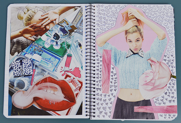
These four pages are generally quite similar in style to those of the first post. They’re quite full, they have lots of doodles and are quite fresh and cute. I really like the sort of ‘Lazy Oaf’, cartoon style vibe that the first page (page 12 to be precise) brings and the contrast of pages 14 & 15. They’re fun, and they all inspiring for different moods. Those love hearts took me a while to doodle in though! 🙂

how to fill a scrapbook scrap social

how to fill a scrapbook scrap social

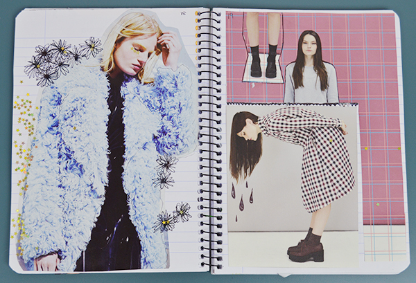
I then sort of randomly went for a more minimalist feel and basically started to stick things on top of each other… random yes, but I like it. I especially love the sort of metallic, liquid metal page. The other page was really an experiment with texture, with a cut of piece of a Topshop sunglasses case, which adds a cool effect. Anything random can come together in it’s own unique way, it really is just a case (I’m so funny) of trying everything out. I added even more texture with some gold stars… I love the way the blue fluffy coat in this editorial picture contrasts with the black doodles. The Whitepepper magazine came in handy for this weird abstract page. Doodling things which would ‘make sense’ seems to work… like the wet dripping hair.

how to fill a scrapbook scrap social

how to fill a scrapbook scrap social

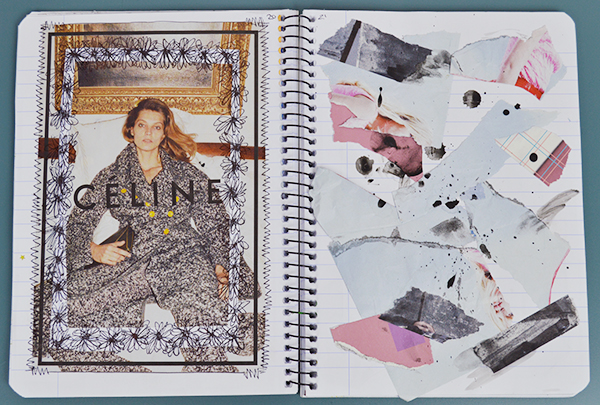
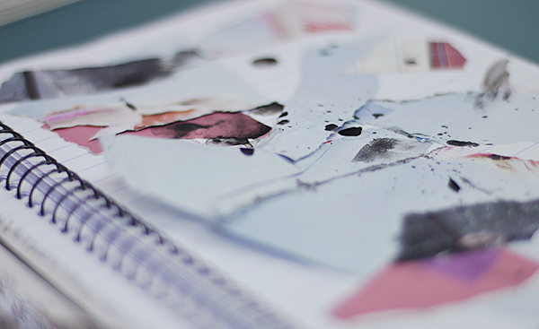
These 2 pages are probably my favourite out of this selection. I just love the way they look together. For the first page I used a Celine advert, cutting a section from it out, and covering the white in doodle flowers (I do love them!) It creates a really nice feel and I think it will be great for inspiration. The next page really is a ‘scrapbook’ page… I used scraps from my scrapbook, tearing them up and sticking them in random places. I then dripped black watercolour over it and I am so pleased! The pieces of torn paper are only stuck down in one place so they over lap and ping up. I just love it! What do you think? I definitely want to experiment with texture some more.

how to fill a scrapbook scrap social

how to fill a scrapbook scrap social

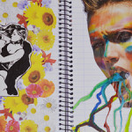
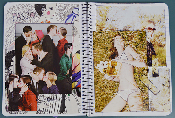
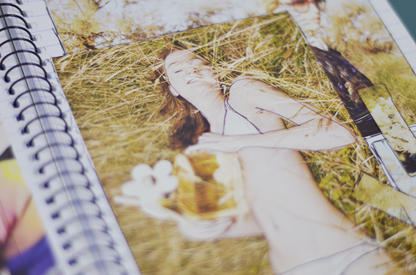
The last page of this Scrap Social post is slightly more obscure. It’s a mix between love and Bohemia… weird or what. I’m not 100% sure on the kissing page… it’s very odd but maybe that’s the beauty of it. The other page is cute though, it’s young and fresh and it all matches nicely. I love the way it all ties in together.

What did you think of this #ScrapSocial post? Which was your favourite page? Do let me know in the comments below! Don’t forget to share your scrapbook photos with the hashtag #ScrapSocial 🙂 See you soon!

You Might Also Like