Tolly Dolly Posh Fashion
Tolmeia Gregory New Site
Browsing Tag

fashion illustrations

LFW Spring Summer 2017 Illustrations | Molly Goddard & Richard Malone

By September 18, 2016 London Fashion Blog Week

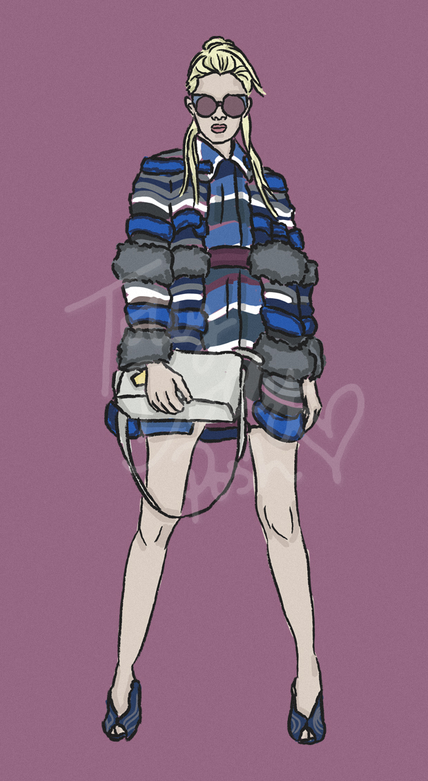
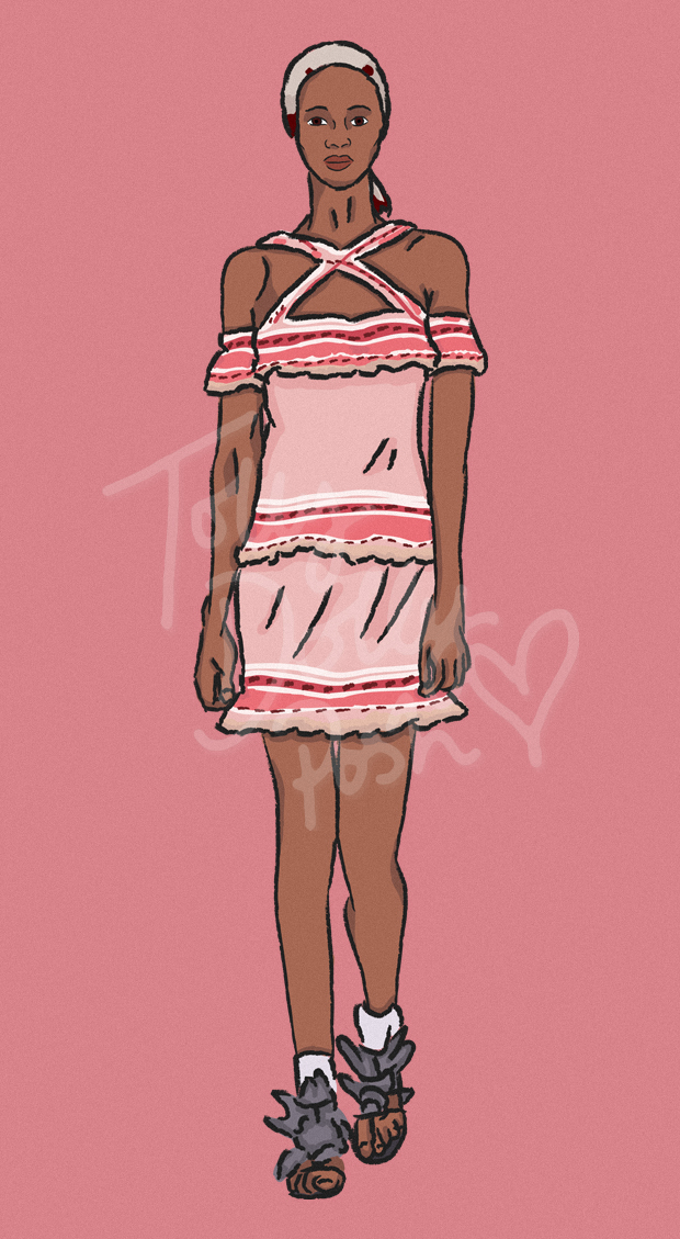
If you didn’t read my last post, then you won’t know that for each day of LFW Spring Summer 2017, I’m going to be posting a couple of illustrations! It’s a more personal way of covering the shows which I, unfortunately, can’t attend this season, so I hope you enjoy taking a look as much as I do making them!
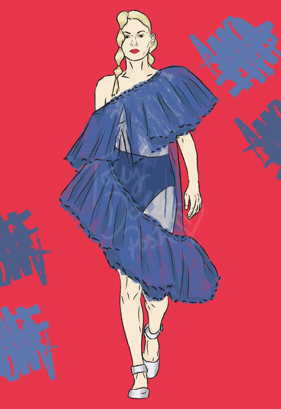
lfw spring summer 2017 molly goddard fashion illustrations


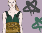
~ MOLLY GODDARD SS17 ~


I’m always in awe of what Molly brings to the table just because she is such a genuine talent and has so much potential and opportunity waiting for her at only 27, and this season definitely didn’t disappoint. It was slightly more wearable than previous seasons in my opinion, with patchwork style hoodies included. It was also a catwalk rather than a presentation like her previous collections have been, which brought to life certain pieces and textures used throughout, like the knitwear and graphic tees.

Although as I said, the collection is more wearable (which I prefer), there were some really eye-catching pieces like this tulle number. The hair and make-up was also really beautiful, so I thought it made for an excellent illustration. Hats off to Molly once again!
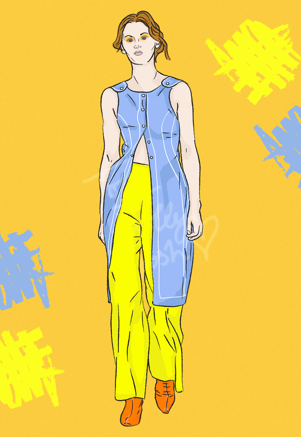
lfw spring summer 2017 richard malone fashion illustrations


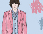
~ RICHARD MALONE SS17 ~


As I mentioned in my AW16 LFW review, Richard Malone is a relatively new discovery for me, but a great one nonetheless. Inspired by uniforms across different industries, specifically nursing (notice the NHS blues?), it’s full of simple cuts and tailoring, and lots of small details like easy to access popper closures, as well as the striking Malone stripes and fitting figures.

It was bright and colourful, but in a minimalistic and themed way, and I can’t scratch away that feeling that there’s an underlying hint of Bowie throughout too (or maybe that’s just the makeup)? I’m actually genuinely interested in seeing how many collections pay tribute to him in some way… I guess we’ll have to wait and see!

What are your thoughts on LFW so far? Which illustration is your favourite? Let me know in the comments!
You Might Also Like

LFW Spring Summer 2017 Illustrations | Bora Aksu & Teatum Jones

By September 17, 2016 London Fashion Blog Week

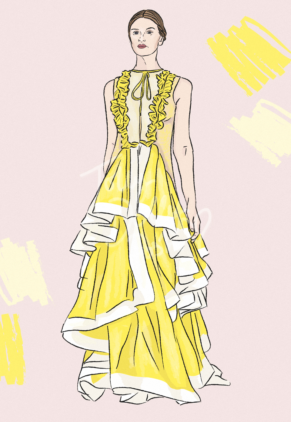
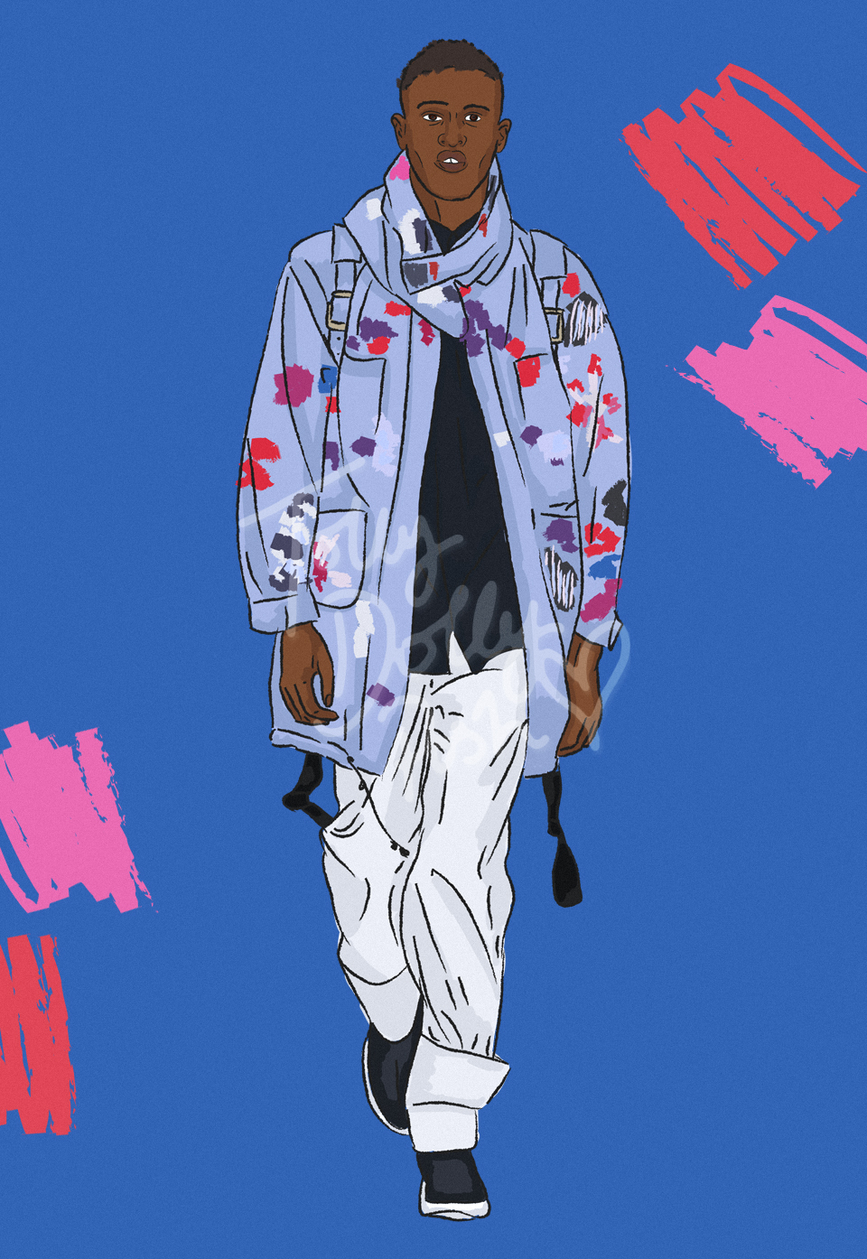
For this season of LFW, I thought I would try something a little different in my coverage of the collections. I usually review the collections using images from elsewhere seeing as I, unfortunately, am unable to attend due to travelling, but I liked the idea of making it more personal to my blog, so for the next few days and for the duration of LFW Spring Summer 2017 (what a mouthful!), I’m going to be posting a few illustrations of some of my favourite stand out pieces from all sorts of designers. To kick things off, I have two sketches based upon Bora Aksu and Teatum Jones…

LFW Spring Summer 2017 Bora Aksu Illustrations


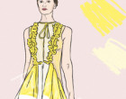
~ BORA AKSU SS17 ~


I don’t think I’ve actually focused on Bora Aksu in any of my recent fashion week reviews, mainly because I like to mix things up and focus on a variety of different styles, and often with designers which focus on traditional processes and fabric, things can become a little stagnant and uninteresting, but for this summer, it seems like they’re reigning me back in!

I’ve explained this before, but some collections truly are like pieces of art. One of my first thoughts was honestly just, ‘beautiful’. The textures and shapes used are so intricate, and I think that’s a huge selling point for me and designers these days. The idea that a piece can be so thoroughly thought out is actually quite inspiring because it pushes me to think more deeply about my own designs. With woodland and fairy-like themes throughout, it’s no wonder that each dress and garment feels like a fairy tale in its own right, and this yellow number is no exception.

LFW Spring Summer 2017 Teatum Jones Illustrations


~ TEATUM JONES SS17 ~


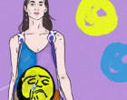
I’m so drawn into shows and presentations which have a deeper meaning to them, so I couldn’t not focus on Teatum Jones this season. The show started with a short film about diversity and sexuality; embracing who you are and not letting anyone stand in the way of who you define yourself as and who you love. It was genuinely interesting to listen to, especially as it was coming from real people (all from Glasgow, in a tribute to Scotland). It was interesting to see how it worked its way into the collection itself… in fact, it wasn’t until closer inspection that I saw words like ‘intersexual’ across the backs of jackets.

The collection was a mix of botanical and watercolour inspired floral prints (which I haven’t done much justice in my sketchy illustrative style), alongside primary colours and paint splatters which I can only presume was a nod to ‘painting your own canvas’ and making what you want out of what you have. The textures were beautiful, with silk and merino wool being the main focus. An interesting clash of ideas, but the message behind it all made it fit perfectly together. It’s awesome to see Teatum Jones back in the menswear realm, too!

What are you excited about for LFW spring summer 2017 so far? Let me know in the comments!
You Might Also Like

Illustrated Pre-Spring Summer 2017 Collections

By June 3, 2016 Fashion

Recently I’ve been getting into digital illustration through Adobe Illustrator. I’m much more of a Photoshop kind of gal at heart, but the smooth and silky fluidity of all the tools on Illustrator has partly won me over. I can create lovely effects and much lovelier strokes and lines than I was able to do before (sort of sketchy and imperfect)… I’ve only been practicing on designer imagery so far, but I definitely want to take this style into my own work and designs sometime soon. So for now, I’ll leave you with a couple of my favourite Pre-Spring Summer 2017 collections that I’ve seen so far… in illustrated form of course 😉 I’ve also posted a couple of other illustrations over on my Tumblr, so do take a peep!

Resort Pre-Spring Summer 2017 Collections - Fendi - Fashion Illustrator

~ FENDI PRE-SS17 ~

Fendi is definitely one of my favourite modern designers and the SS17 has so much to prove as to why they should be one of your favourites too! With influences from antique Japanese prints and American flag inspired motifs, it might seem like an odd combination but it blends perfectly. It almost has a fairytale, Alice In Wonderland theme to it, especially with the collection shots. The checkered skirts meet woodland creature like furs (I can’t say it’s faux) and oversized coats. It’s several different things colliding at once but it works well because it shows Fendi’s talent for merging innovation and classic techniques all into one.

Resort Pre-Spring Summer 2017 Collections - Chanel - Fashion Illustrator

~ CHANEL PRE-SS17 ~

Over the past few years I think Chanel has become a much more relatable name and power house, mainly because of what Karl Lagerfeld has started to do with the collections becoming more of a statement to do with topics of the time. This time it was all about Cuba. Not only was the setting an important one, but so was the collection itself. It’s full of texture and depth but in a simplistic way, and I think that’s what you need for a pre-collection. You can read more about it here… it’s quite an interesting one.

Resort Pre-Spring Summer 2017 Collections - Louis Vuitton - Fashion Illustrator

~ LOUIS VUITTON PRE-SS17 ~

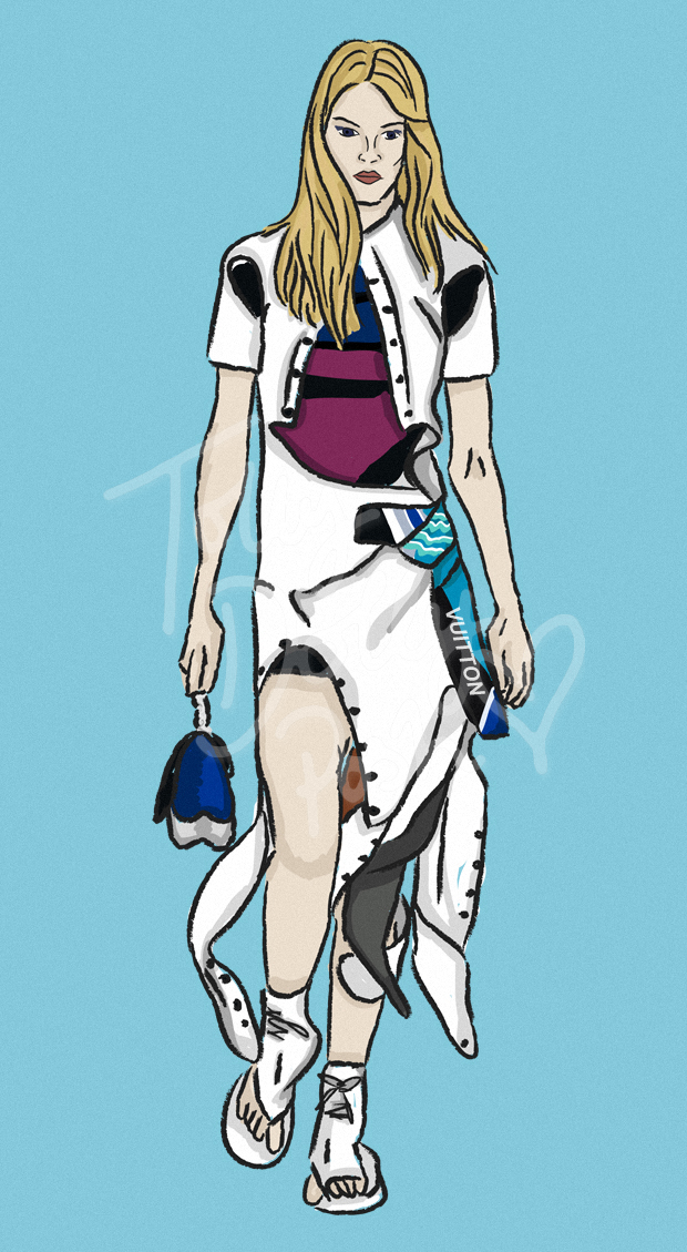
As pre-collections usually do these days, this collection was off on a travel to Rio, in celebration of the Olympics which are right around the corner. Inspired by athleticism and sports… a display of a young woman who has an edge about her, but might also be straight from the 1980s with her neon coat and a boombox in hand (well, a bag which has bluetooth and can play music, at least).

Where most sporty collections fall short of actually being ‘fashionable’, this collection picks it back up again with ruffled leather and suede paneled shirt dresses. I’m not usually one to gravitate to Louis Vuitton, but I’m certainly intrigued for what’s to come in the main, SS17 collection.

Resort Pre-Spring Summer 2017 Collections - Bottega Veneta - Fashion Illustrator

~ BOTTEGA VENETA PRE-SS17 ~

I’m not going to deny the fact I only recently discovered Bottega Veneta through the interwebs (actually an actress from *cough* a certain TV show which we shall not mention because you’ve probably already heard enough about it from me on Twitter or Instagram), but I’m in love with their elegant minimalism.

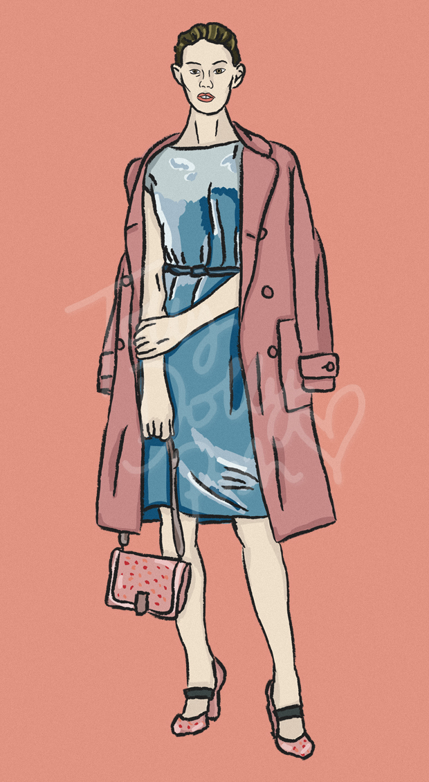
I love seeing designers who blend modern techniques with old ones, which I suppose is one of the main reasons I’ve chosen all of the designers I have… Bottega has a great way of doing this though, because it’s all on the surface. Their are frills and exciting elements, but they’re obvious ones which make each piece bolder. All of the fabrics look almost edible, especially with the candy colours, which we saw a lot of on the AW16 runways. They’re a nice new discovery, for me, anyway.


What do you think of the Pre-Spring Summer 2017 collections coming in so far? Which are your favourites?

You Might Also Like

“La Grotte” Inspired Fashion Designs & Moodboard

By August 23, 2015 Designs

It has been a while since a design post, huh? I find because I’m my own worst critic, that I tend to only want to share work with you that I’m 100% happy with, and that is why my design page may look very empty now… I just need a fresh start and to start showing you things that I’ve actually worked on as proper little projects. Alongside this one, I made draft pattern pieces, and A3 final illustrations (which look a lot better than the digital ones actually)… so there’s a lot more to it than what meets the eye!

La Grotte Lacave Cave Inspired Fashion Designs

La Grotte Lacave Cave Inspired Fashion Designs

La Grotte Lacave Cave Inspired Fashion Designs

~ THE INSPIRATION ~

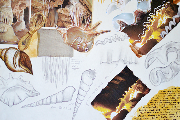
With the designs that I’ve done more recently, I’ve really tried to take inspiration from anything to get my creativity flowing, and this time I took to the underground French caves! We’ve visited a few when we’ve been over and they really are quite fascinating, and full of different shapes and textures. The main inspiration was this weird wavy crevasse that I saw above our heads and it spiralled into lots of different ideas.

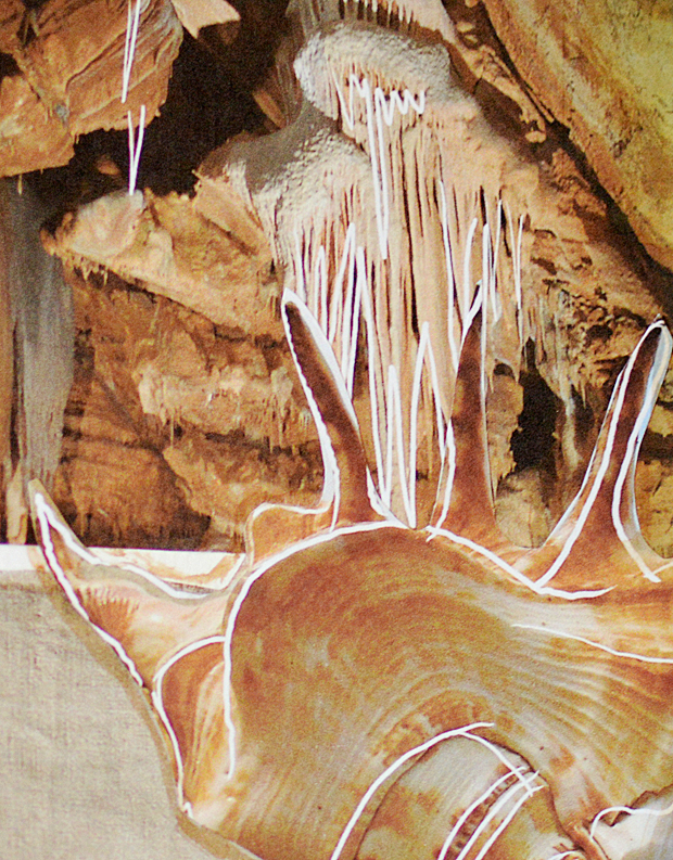
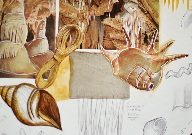
My moodboard is rather small but it actually really helped in thinking up the smaller details for my mini design “collection”. I also realised that the stalagmites reminded me of certain shells with their curves and pointed edges. I also discovered a cool method to highlight inspiration by drawing over with white in Photoshop.. I really like the effect!

La Grotte Lacave Cave Inspired Fashion Designs

~ TULLE DRESS ~

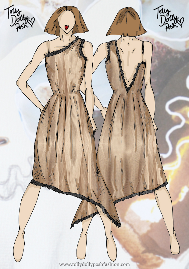
The jagged edges from the caves reminded me of the amazing use of raw and jagged tulleso I drew up a little dress featuring smaller details like messily folded and pleated hemming and drop back that looks like a crevasse it’s self. The idea is that it would be gathered at the waist but fairly loose and full in the skirt. As tulle is so light it would need several layers and a lining to really bring it altogether.

The dark black pleated detailing reminds me of the deep shadows that are created from artificial lighting deep underground. The pleats would be messy and uneven to create that jagged effect.

La Grotte Lacave Cave Inspired Fashion Designs

~ SILK TOP & BURLAP (TWINE) LONG SHORTS ~

For the next “look” in this mini collection, I decided to use silk on top. After connecting the dots between the shells and the cave, I decided to draw up a floaty and boxy silk top that would have looping curves around the neck, arms and hem line to remind me of the inside of a clam or the smooth water that dripped below the ground. There would be covered buttons on the back with a tab opening also, I just didn’t include it in the basic design! 

For the long shorts, they would be a lined pair of raw, burlap material. I call it twine but it’s probably the complete wrong word! They’d hit just on the knee, with the frayed edges almost being a bit of a tickle. The texture and roughness reminds me of the rough cave walls and the big pockets are also a nod to the big drops that plunge into darkness.


What do you think of my cave inspired collection? It’s simple but has a lot of thought in it. Let me know the comments if you’d like to see this style post in the near future!


You Might Also Like

Illustrated Fashion Bloggers & Floral Crowns

By April 1, 2015 General

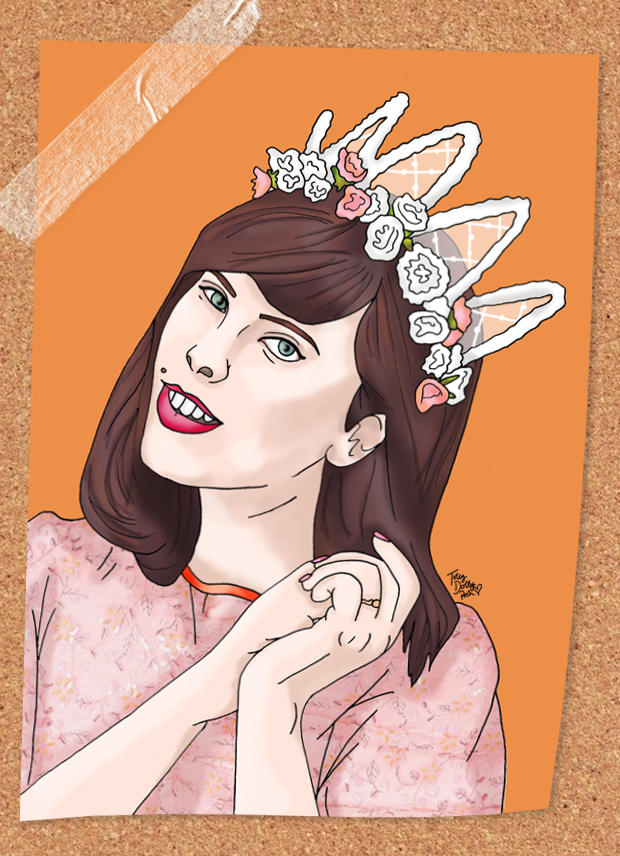
I like to draw. I like to create and I really like to illustrate. I also love floral crowns and I kinda’ like fashion bloggers too, so I guess if you mix all of those things together, you get a pretty cool combination. So today, I’m sharing the outcome of that pretty cool combination in this ‘floral crowns and fashion bloggers’ illustration series… ooh yeah…

Illustrated Fashion Bloggers Carrie WishWishWish.net~ CARRIE: WISHWISHWISH.NET ~

This is probably my favourite of the three I completed (well 4, I did actually draw the darling Liv Purvis but unfortunately I wasn’t 100% happy with it) as it’s just so pretty. This is probably one of my favourite pictures of Carrie ever (I mean to be fair most of her pictures are absolutely stunning), so I knew I had to transform it into my very own piece of artwork. I’m pretty fond of the bone structure (never thought I would every say that in a blog post!) I managed to produce and the glossiness of Carrie’s eyes… okay this is getting weird, but I do really love this one… although, it does make me sad that I don’t have the dress she’s wearing, I wanted it for such a long time!

carrieCarrie’s blog is a beautifully glossy fashion and photography blog which you should all follow. She’s recently started to dabble in YouTube and her recent vlogs have been equally as gorgeous as her photographs. Follow her on Bloglovin!
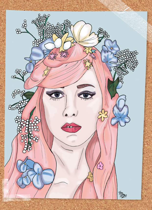
Illustrated Fashion Bloggers Kailey Mermaidens.Blogspot.Com~ KAILEY: MERMAIDENS.BLOGSPOT.COM ~

This is the first illustration I completed so you may have already seen it on my Twitter/Facebook/Instagram! It’s a slightly different style to the other two but it doesn’t matter because I think it portrayed Kailey’s pastel perfect hair and make-up really well! This picture is from a self-portrait Kailey did recently and it really does sums up who she is, which I love. I’ve seen other people’s illustrations of this picture too so it’s super inspiring to see the different techniques that are used.

KaileyIf you like all things pastel and you like photoshoots involving burgers and donuts, then you’re in for a treat over on Mermaidens! Don’t forget to follow Kailey’s Instagram too, it’s a beautiful account which even Instagram themselves have been loving (yeah, they posted her picture). Follow her on BlogLovin! 

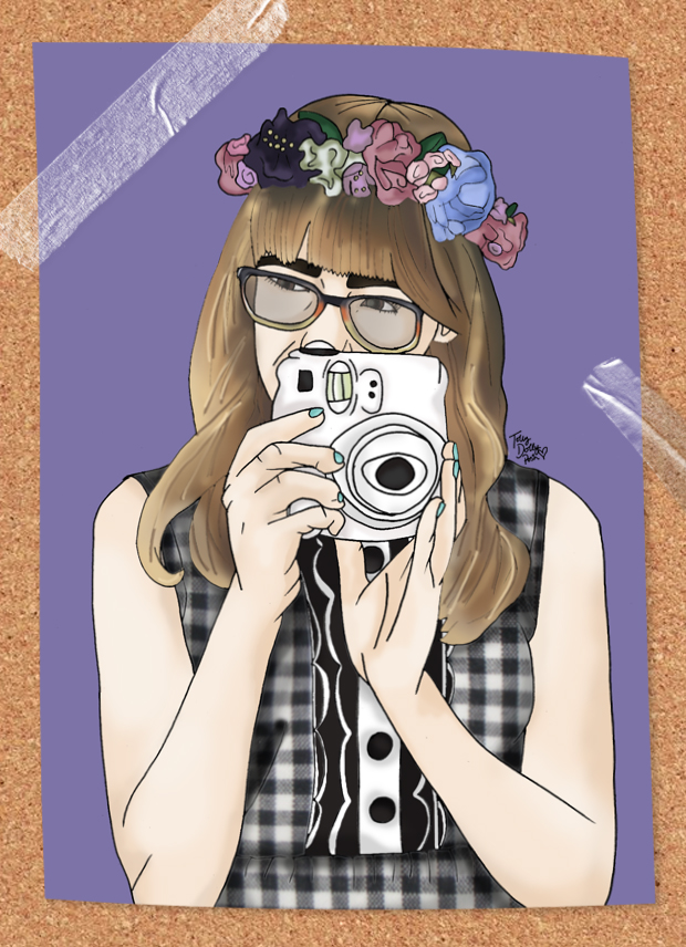
Illustrated Fashion Bloggers Emily Jane Blog EmilyJane.Typepad.com~ EMILY: EMILYJANE.TYPEPAD.COM ~

I couldn’t leave out the teen bloggers of the world so I scoured back through my favourites and found this photograph of Emily and started work on it immediately! Although there are a few imperfections here and there, I’m really happy with this one too (that’s about the 1,164,912,301,923th time I’ve said that isn’t it?). I especially like how the floral crown worked out.  I also love Emily’s pose in this… it’s so fun and it makes me so envious of her Instax camera…!

Emily JaneEmily is a teen blogger I’ve admired for a long while now. Her photographs always consistently cute and she has worked with some amazing brands and people. I think it’s really cool to see another teen blogger being so consistent and for sticking at it for so long! She’s 16 now and totally deserves a follow! Follow her on BlogLovin! 

I hope you enjoyed this mini set of floral crowns and fashion bloggers! I’m really happy with these and was actually kinda’ contemplating setting them up for sale (if the lovely ladies allowed me) but for now I’ll pin them up in my room and appreciate their amazing talents which I enjoy reading on a daily basis! 🙂

You Might Also Like

Paris Fashion Week Inspired Fashion Design Sketches

By March 20, 2015 Designs

Wow-wa-wee-wah. What a day, huh? First a total eclipse happened in Europe (well, I saw a partial eclipse, but it was still pretty epic) and now a fashion design post? I was actually kind of unsure whether to publish these designs because I personally don’t think they’re great… but then I guess we’re all our own worst critics so I thought I’d leave it up to you to decide! They’re not digital which is something new, and that means imperfections like pencil marks and wobbly lines… but hey ho! Here are a few Paris Fashion Week inspired design sketches 🙂 Let me know what you think in the comments, I’d love some feedback!

Paris Fashion Week PFW Fashion Design Sketches

Red Skater Dress with Sequin Patches & Thigh High Leather Boots…

Over the fashion week period I noticed quite a lot of ‘sexy’ red pieces… yup! Skimpy red mini dresses and plunging neck lines. All very saucy indeed, so I decided to take that and make it my own. A figure hugging skater dress with sequin patches for a hint of glamour. The leather thigh high boots are also quite risqué and feature 2 panels of tight lacing to reveal skin and add to the drama of the look.

Leopard Panel Shirt & Striped Pencil Skirt with Tulle Hem…

I saw quite a bit of leopard print in some of the shows too, specifically at Miu Miu, and it really inspired me for this piece. Combined with another PFW trend of laid-back styles, I think it’s quite a cool combo! The skirt is perfect for tucking the shirt into and compliments the different colour panels. I also spotted hints of tulle down the Parisian runways, hence the cheeky bit of tulle hemming.

Paris Fashion Week PFW Fashion Design Sketches

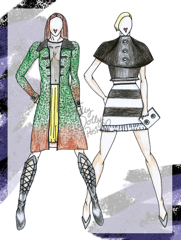
Green and Orange Leopard Coat, Mesh and Tulle Skater Dress & Knee High Leather Boots…

Another Miu Miu inspired piece with this green and orange ombre print coat. The bold print is complimented by the sweet style of the collars and fitted arms. Bold buckles fit together at the cuffs for a more structured look. Underneath is a mesh and tulle skater dress for another touch of sauciness. The skirt of the dress is a thick layered tulle in bright yellow; this is also featured on the cuffs of the dress too! A similar pair of leather boots but instead of two panels, just the one laced panel down the front to elongate the wearers legs. What do you think?

High Neck Cape-Top & Striped Mini Skirt with Tulle Hem…

One trend for AW 15/16 that seemed stronger than ever, was the all-black combination. This look is sort of inspired by lots of different shows but now that I look at it, it does sort of remind me of the Chanel show (such a cool show, set in a Parisian style cafe). The cape-top is a structure piece which looks like 2 separate layers. The bold white buttons have tulle detailing on them which joins in the with the skirt. The skirt of which is a striped mini skirt again with the same tulle hemming. The look would be paired with a white box clutch with the same tulle buttons as on the cape-top.


These designs are my own original ideas and I would really appreciate it if you didn’t publish/use these images without permission. Get in touch if you’d like to use them. 


So yup! Do let me know what you think of these… I’ll try to post more designs but as my days get busier (I’m talking Mooi en Lief by Tolly Dolly Posh kinda’ busy) it’s pretty hard to publish them regularly. Anyhow, I shall be back soon.. watch out, it’s a prom post next 😀

You Might Also Like

Designs: Appliqué & LFW Inspired

By February 18, 2014 Designs

Howdy! It has been yonks since I last did a design post and I know you guys love them, so sorry! These posts do take a lot longer to create than other posts so that is why there was a delay, but here I am now! This collection is partly inspired by my Appliqué post and also some of the collections from London Fashion Week.

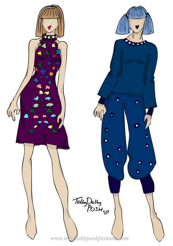
appliqué london fashion week fashion design collection, teen fashion designerPurple Halter Neck Dress with Appliqué & Bead Detailing (left) and Batwing Top and oversized Hareem Trousers with Bead Detailing (right):

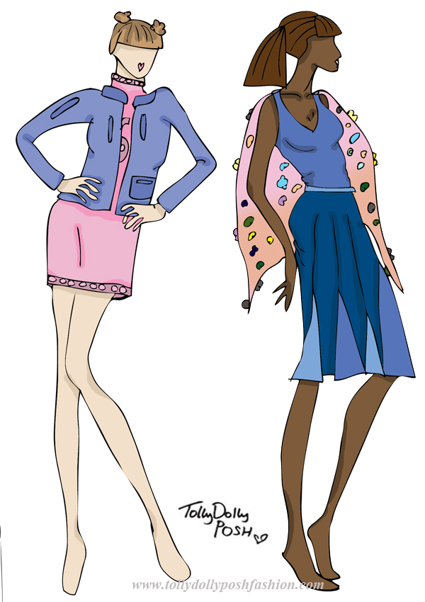
On the catwalk this LFW, I saw a lot of halter necks, so this dress is definitely inspired by some of the collections. I also saw a lot of symmetrical detailing, so the appliqué on this dress is also inspired by LFW. I think the symmetrical detailing is actually quite flattering to the figure too! Another thing I picked up from the shows were the ‘Chanel-esque’ bead detailing on neck line and hems, so I added that to the neck of this dress. The top and bottom on the right are inspired by the bagginess of some collections I saw. The slouchy fit and pyjama type style is something I wanted to come across, but also with a bit of detailing and appliqué. The fabric would be a jersey fabric so comfort would be key. appliqué london fashion week fashion design collection, teen fashion designerKnitted Turtle Neck Dress with Appliqué Detail & Blue Leather Bomber Jacket (left) and Blue Vest with Mixed Blue Panel Skirt & Sheer Cape with Appliqué Detail (right):

 I really liked the use of pastels for A/W 15′ so I thought I would interoperate that into these designs. The knitted dress would be a soft knit, with a pink appliqué ‘sport’ detailing like a number. The bomber jacket would be quite vintage looking in a nice blue but with darker blue detailing on pockets and zips. Retro, but with a modern twist. The other design is inspired by a lot of panelling I noticed. This skirt is very flattering and the mix of blue colour makes the movement of the skirt look awesome! The cape would be sheer with 3D flowers as again, they were all of the catwalks.

I hope you liked this short but sweet blog post! I’m going to start to learn a lot more fashion-y things soon so hopefully these posts should start to improve! But for now, enjoy!

You Might Also Like

Lazy Oaf Inspired Design Collection

By November 29, 2013 Designs, Fashion

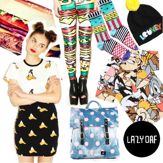
Hello! I’m really excited about this blog post! Don’t get too excited, I’m not working with Lazy Oaf (…although, I wish I was!), but I love the brand so I thought it would be cool to create a Lazy Oaf inspired design collection, as if I was collaborating with them. I hope you like them, and if you do, make sure you tweet this, and maybe, just maybe, Lazy Oaf might see it! 😉 Oh, and Lazy Oaf (or anyone else), please do NOT pinch any of my ideas! Please! 😉

lazy oaf fashion designer teen fashion designer illustrations fashion design ideas collaborationI thought it would be nice to do a sort of mood board so you can see what feel I was going for. Lazy Oaf are like the God of funky prints, modern pop art, food on clothing and just anything awesome. I wanted to take their love of prints, and also their love of shirts and combine them in my own way. My first thoughts were ice cream, and I wanted to do 4 seasons of ice cream. The classic ice cream and Flake would be for Spring, the melting lollipop for Summer, a pumpkin ice cream for Autumn and the ice cream stuck on a tongue for Winter. Unfortunately I had to go with the 3 seasons of ice cream because the Autumn one didn’t work out so well, but none the less I hope you like my little ideas!

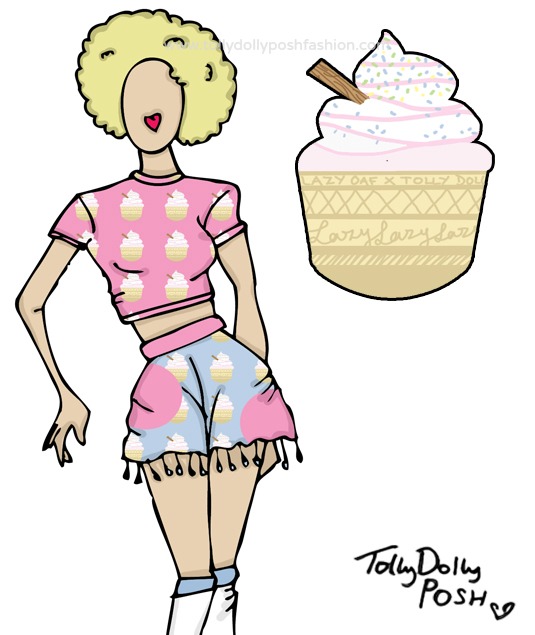
lazy oaf fashion designer teen fashion designer illustrations fashion design ideas collaborationSpring/Summer (Ice Cream): Pastel Pink Ice Cream Print Crop Top & Pastel Pink and Blue Ice Cream Print Spot ‘Skort’ with Pom-Pom Trimming 
I really like this because the pastel colours just add that perfect base for all things Spring. I also love how they are quite subtle, but they bring both the top and ‘skort’ to life. The top would be cropped with short sleeves and a high neck line, giving it that 90s, retro feel, which I think Lazy Oaf are all about. The ‘skort’ would have a pom-pom trim which just adds that little bit more texture and layers to the piece, and I think that is what Lazy Oaf often do. I think you could make some really nice outfits from these pieces, whether you like pink, or you just love anything retro! I also love how the ‘skort’ could be used as a piece of beachwear.

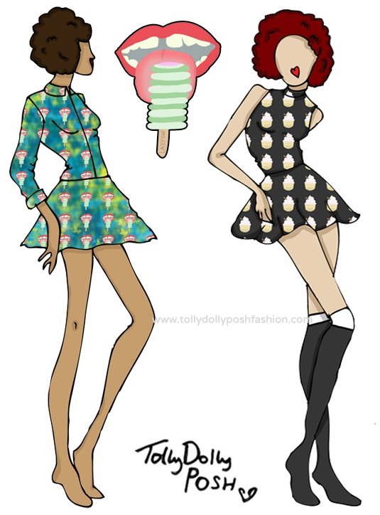
lazy oaf fashion designer teen fashion designer illustrations fashion design ideas collaborationAutumn/Winter (Frozen Tongue – left): Green and Blue Tie Dye Blouse and Skirt with Frozen Togue Print. Spring/Summer (Ice Cream – right): Charcoal Black Polo Neck Top and High Waisted Skater Skirt with Ice Cream Print 
These are my two favourite designs because I think they are classic Lazy Oaf. I love how on the blouse and skirt (left), the Frozen Tongue print just pops against the green and blue tie dye. As I said, Lazy Oaf love using shirts with prints, so I had to include one, and I think this one is perfect, and because it has the green in there, it really fits in with the A/W feel. You could pair the two together, or you could wear it is separately, which I think any collection needs to offer. With the top and skirt (right), I think they would be perfect for all seasons because you could easily layer them, and the ice cream print again, just adds that perfect extra boost for a new layer and dimension.

lazy oaf fashion designer teen fashion designer illustrations fashion design ideas collaborationAutumn/Winter Menswear (‘I Scream’): Charcoal Black and White Top with Lazy Oaf in Pink and I Scream Text & Charcoal Black Beanie Hat with Embroidered Melting Ice Lolly and I Scream Text 
I think I had to include some menswear in this mini design collection, because the Lazy Oaf guys are ‘stylish’ haha! I think that these pieces are very ‘Lazy Oaf Guy’-ish (lol)! The top would have Lazy Oaf on the front filled in with the Frozen Tongue print, and would have patches of ‘I Scream’ text on the hem and sleeves. The beanie would have embroidered ‘I Scream’ text and the 2 embroidered Melting Lollies, which I think is a nice contrast between Summer and Winter.

I hope you liked this little design collection, and if you did, please please please leave a comment, or tweet it because wouldn’t it be fabulous if Lazy Oaf saw it?! Urmm.. yes! Thank You 😀

You Might Also Like

Mini Design Collection: Teen A/W Fashion

By November 2, 2013 Designs

”Honey, I’m home!” – Okay, maybe not ‘honey’ but, yes, I am back! The trip was really nice, fun and exciting (shopping, and new born baby cuddles, what more could you want?), but sadly I am back 🙁 I have a cold, and I miss my sister a lot. But, to get things started again, I’m here with teen a/w fashion design collection! Please excuse any abnormal legs in this collection… aha!

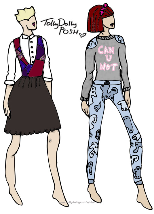
teen a/w fashion design collection teen fashion designerMixed Knit Pinafore Dress and White Blouse (left) & ‘Can U Not’ Marl Sweater and Paisley Print Mixed Denim Jeans (right):

I feel like this dress (left) is a mix between an old man’s sweater (lol), and a waitress’s dress (weird…) but someone how I think it looks pretty cool. I would hopefully make the top part of the dress a knitted part, and then the scalloped skirt either a jersey material, or a chiffon material, I cannot decide! I would also make the top part detachable, because I hate it when the skirt part of a dress is also nice on it’s own! The blouse would be an ordinary white blouse, but with some nice floral buttons. The ‘sweater’ on the right, would be a nice marl fabric, with soft fluffy lining. On the front it has ‘Can U Not’ (one of my favourite sayings at the moment) in a pastel pink colour. As you can see, the shoulders have a blue detailing, which would have a ? (question mark) print. The jeans are a mixed denim paisley print skinny jean. I would want them to be quite skinny, but comfortable so they would fit most teens.

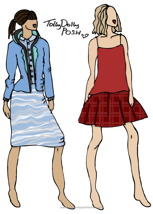
teen a/w fashion design collection teen fashion designerBlue and Grey Hooded Blazer/Jumper, Pastel Blue Blouse and ‘Soundwave’ Print Tube Skirt (left) & Red Chiffon Vest and Deep Red Checked ‘Party’ Skater Skirt (right):

I thought of a jacket which would be perfect for teens, whether it was for just casual use, or for at school (if you don’t have to wear uniform that is), and I made up the perfect of pieces! It’s basically a jersey material blazer, with hood, and a thicker lining, so it keeps the comfort of a hoody, but style of a casual blazer, all in one. The skirt is a tube style, so it comes just to the knee, and the blouse, again is just a plain one, but with the collar in a lighter blue than the shirt itself. The vest on the right, is one of those chiffon-y, lightweight, floaty ones, with skinny straps. The skirt would be a nice thick, but easy wear, skater style, in  a deep red check, to go along with the A/W trends.

I feel like all these designs are very teen appropriate. What do you think? Make sure to leave me a comment down below! Also check out my previous designs here.

**Make sure to check out Let’s See, the awesome photography blog, which I absolutely 100% honestly love! (This is a sponsored link)**

You Might Also Like

The Collective Boutique: Mini Design Collection*

By October 8, 2013 General

I have sort of kept my promise of doing more designs… because, here is another lot! This collection is a little different though, because they are all based around one of my favourite necklaces from the online jewellery boutique, The Collective… (May I also say a big thank you to everyone who left such lovely lovely comments on my Ultimate Guide to Being a Teen, it was so nice to see you what you thought of it! Thank You!)

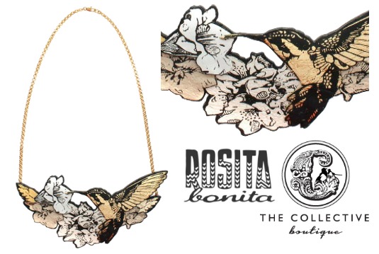
the collective boutique rosita bonita

Leather Bird Necklace by Rosita Bonita (The Collective Boutique)
I have based the collection, on this gorgeous necklace by illustrator and jewellery maker, Rosita Bonita. I am absolutely in love with some of her illustrations (see them here), they seriously are really nice! The illustrations are screen printed onto leather which makes the necklace even more special. I think it would be perfect for a gift or a little treat for yourself. It’s gorgeous! 

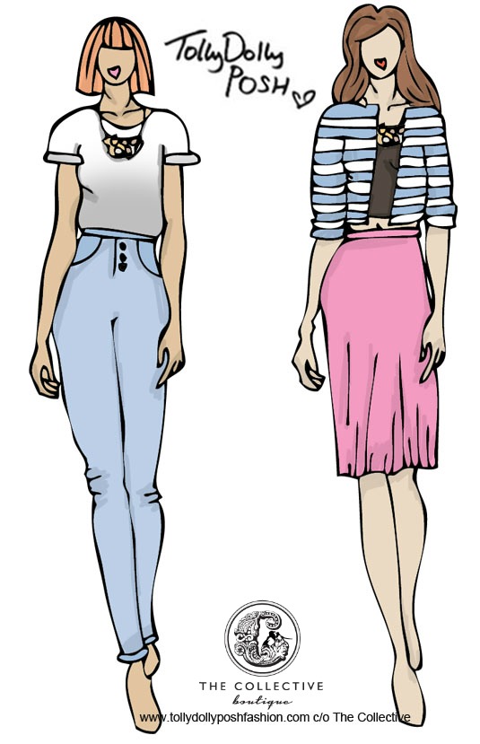
the collective boutique rosita bonitaOmbre Top & Pale Blue High Waisted Jeans (left) and Stripey Jacket, Black Cami & Pink Pleated Dress (right): For the ombre grey top, I would make it a silk material. I think it would really compliment the metallic tones in the necklace. The sleeves would be rolled up because I think the style is really flattering on most people. The pale blue denim high waisted jeans, would be a perfect pastel colour, which really compliments the grey from the top, and again the colours in the necklace. For the jacket (right), I would make it a jersey material so it was more for casual wear, with the blue stripes being a similar colour to the jeans on the left. I would pair it with a floaty cami which seem to be very ‘in’ at the moment (not saying that you should wear everything that is on trend, I just like the style…). The pleated skirt would be in a nice floaty material, in a nice sort of ‘sorbet smoothie’ pink colour. I really like these two looks and the colours are just perfect – If I do say so myself.. haha!

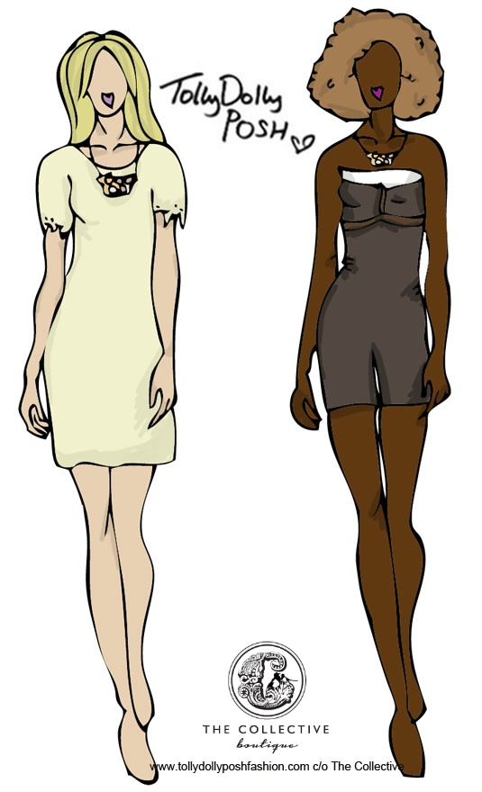
the collective boutique rosita bonitaCream Dress with Lace Sleeves (left) and Monochrome Playsuit with Mesh detailing and a White Envelope Collar (right): For the dress, I think it would be a good piece to dress up or dress down. I would make the sleeves with a sort of lace, laser cut detailing. The shape of the dress would be a simple shift dress, so that accessories, or the necklace in this case, can do the talking. The playsuit, again is very simple, so it can be ‘glammed’ up or worn casually. I’ve made a twist on the sort of ‘corset’ style detailing, and instead, made it a mesh detailing… cheeky 😉 Haha! The colour isn’t quite black, but isn’t quite grey, it’s almost a grey/black/brown which means it’s less obvious, and the necklace can really pop on top of it. These 2 looks are really versatile too, which means you could wear the necklace how ever you like.

Music for the Catwalk?: I Can’t Stand The Rain – Ann Peebles
Outside or Inside Catwalk?: Outside – natural birds tweeting to match the bird design!

I really enjoyed doing this little collection, and has made me fall in love with this necklace even more! It’s so simple, yet makes a really nice statement. Make sure to check out the other pieces on The Collective Boutique site, some of it is gorgeous!

Quick side note – I’m an AUNTY! My little Nephew was born on Sunday morning, and he is just absolutely gorgeous and perfect in every single way! Eeeep! 😀

(This collection was sponsored by The Collective Boutique. I may have been paid or gifted to produce and publish this post, but all opinions are 100% honest. Designs by me and thought up by me! Read my full disclaimer here.)

You Might Also Like