Tolly Dolly Posh Fashion
Tolmeia Gregory New Site
Browsing Tag

fashion designer

#MooiEnLiefbyTDP Homo Superior Socks Give-away!

By September 13, 2015 Shop

The winner of the “Electric Blue” give-away was… Adele P!


I’m back today with a give-away of the “Homo Superior” sock design from my very own Mooi en Lief by Tolly Dolly Posh collection. Congratulations if you were the winner of the “Electric Blue” pair! If you didn’t win though, there’s still chance to grab a different design, or shop the whole collection here! Good luck and happy shopping 🙂

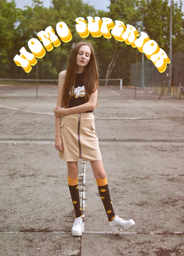
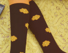
Mooi en Lief by Tolly Dolly Posh Socks Knee High - Homo Superior - David Bowie Inspired

Mooi en Lief by Tolly Dolly Posh Socks Knee High - Homo Superior - David Bowie Inspired

Mooi en Lief by Tolly Dolly Posh Socks Knee High - Homo Superior - David Bowie Inspired

Mooi en Lief by Tolly Dolly Posh Socks Knee High - Homo Superior - David Bowie Inspired


SHOP “HOMO SUPERIOR” HERE


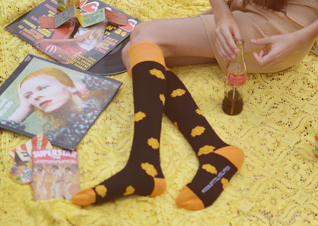
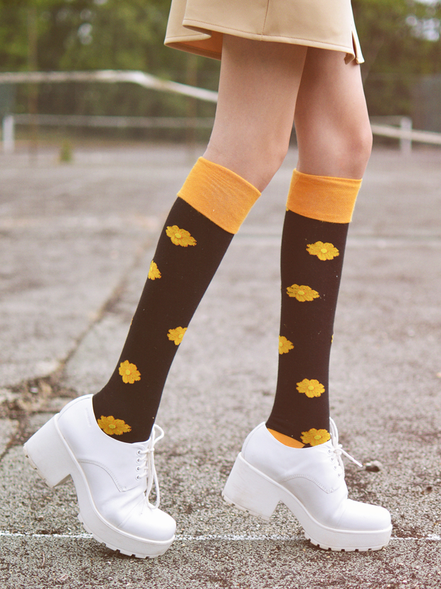
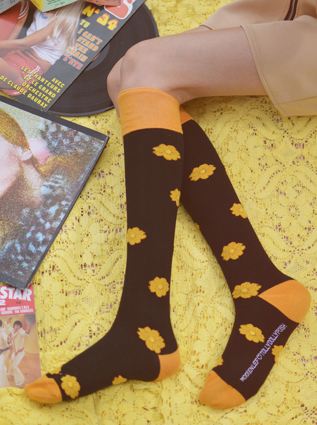
“Homo Superior” was inspired by the record cover of David Bowie’s ‘Hunky Dory’ album, and the song ‘Oh You Pretty Things’ which features the line of lyrics… ‘You gotta’ make way for the Homo Superior’. Homo Superior basically means somebody of supernatural powers, so a bit like a super hero. In my opinion socks are a very big part of a super hero’s costume so it fits well, right?

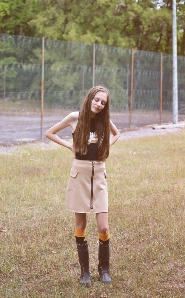
This pair of socks looks awesome with suede and could totally work with a biker jacket too. Throw on a worn out pair of Converse or of course, Mooi en Lief’s very own “Black Buckle” wellington boots and “Feather Festival Style Kit”As an entry to this give-away, leave a comment letting me know how you’d style up this pair of socks!

Mooi en Lief by Tolly Dolly Posh Socks Knee High - Homo Superior - David Bowie Inspired

Mooi en Lief by Tolly Dolly Posh Socks Knee High - Homo Superior - David Bowie Inspired


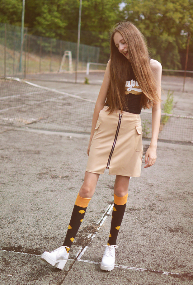
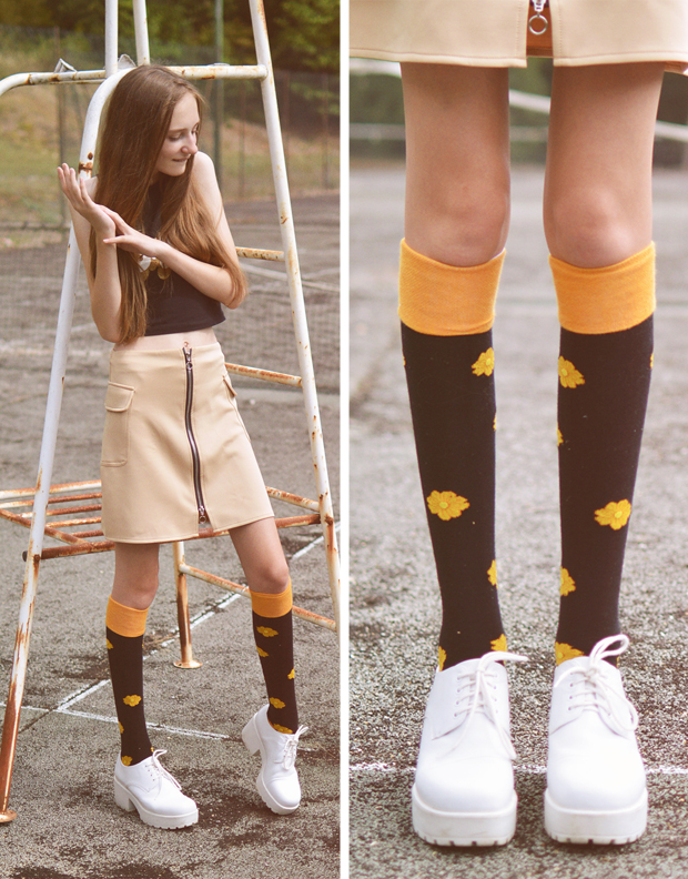
Top (ASOS) // Skirt (Missguided) // Socks (Mooi en Lief by TDP) // Shoes (Vagabond)


I think you guys are loving this pair of socks! There simple and perfect for the upcoming A/W season. I’ve already worn them out with some boots and they look super cute! I hope you enjoy wearing them as much as I do. Want to win a pair? Scroll down for the give-away…

Mooi en Lief by Tolly Dolly Posh Socks Knee High - Homo Superior - David Bowie Inspired

a Rafflecopter giveaway


Rules + T&Cs: The give-away is open worldwide. The prize will be delivered by Mooi en Lief on behalf of Mooi en Lief by Tolly Dolly Posh. You must be have permission from a guardian/parent (if you’re 13 or younger) as you will have to email your postal address. The prize is one pair of the “Homo Superior” design. The give-away closes on 17th September 2015.

You Might Also Like

How To Keep Your Creative Juices Flowing by Mama Posh

By February 11, 2015 DIY & Lifestyle

Hello everyone! Do you remember a while back, I got Papa Posh (aka. my dad) to write a lil’ post for me? Well, you guys seemed to really like that, so today I have dragged in Mama Posh (can you guess who she is?!) to do one too! I’m hoping to get most of my family members to write a post each, so it should be fun! Today Mama Posh is going to speaking all about how to stay creative. We’re a pretty creative family, so hopefully this will help, especially for you fellow bloggers 🙂 Take it away Mama Posh…
how to stay creative blogging art

Even on your bad days you can always be creative! Have you ever got up in the morning and thought, ‘I am so bored, I cannot think of what to blog, or what to do today?’. As a designer myself, I sometimes find annoying life problems can be discouraging and depressing, and find that trying to brainstorm just isn’t enough – after all, I’m short on inspiration, brainstorming isn’t going to turn up much! So today I thought I would jot down some tips for you…

Watch a movie…

Feeling really down and totally uninspired? Watch a good movie, buy some good old fashioned sweets, get a big warm blanket, snuggle down and enjoy. You will find little inspiring thoughts will spring to mind and will usually stay with you, so you can use them at a later time. It’s often good to re-cleanse your mind and just relax.

Look, look and look again…

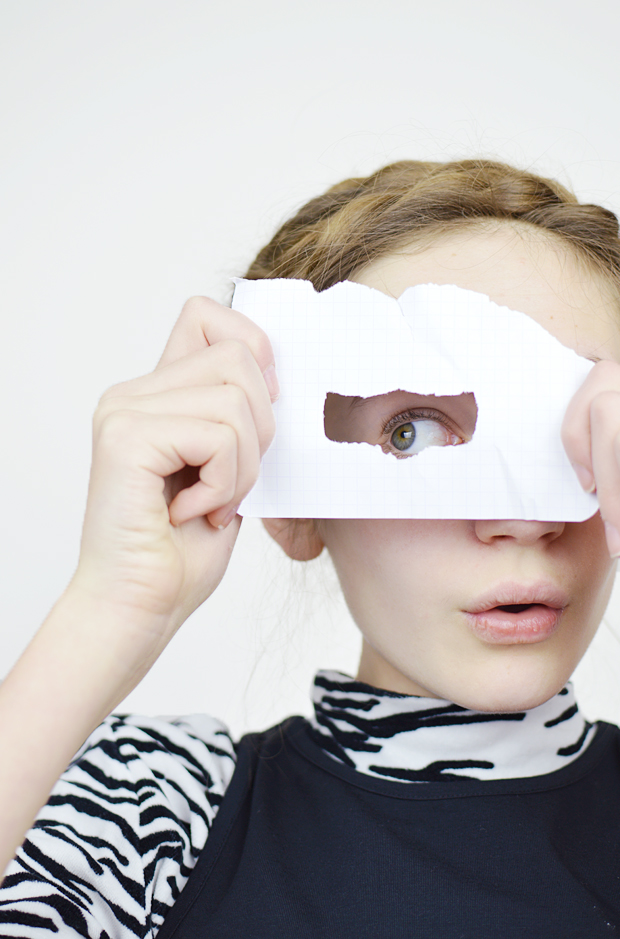
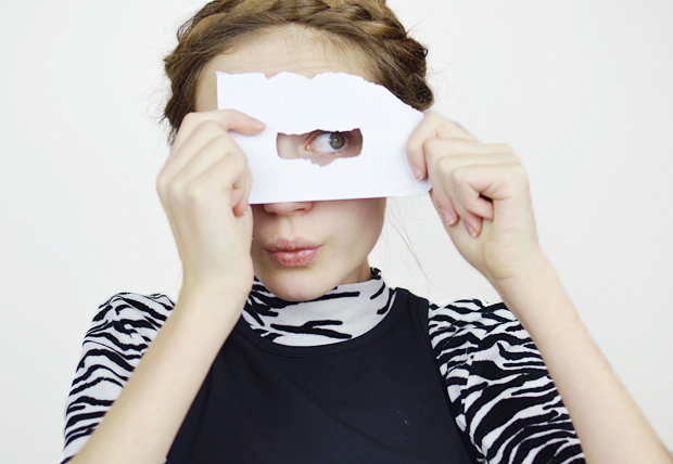
Remember to look at your surroundings. Many of us go through our day through blinkered eyes; try to find inspiration in everything you see. I recommend cutting a small hole in a piece of paper, pop it in your pocket and when you are alone, on a journey or walking, take this paper and look through it at the world around you, and guess what? You will see everything in a totally new light!

Become a scribbler…

Always have something to write with, even in the most absurd of places! Take a pen and paper, any scrap will do, and draw and write about everything you see, wherever you go. Write on tickets, wrappers, cans, whatever you can scribble on! Keep all of these little notes in a scrapbook or journal to flick through from time to time.

how to stay creative blogging art

Be curious…

Creative people are insatiably curious. Like me, curious people ask so many questions! Look at the world around you and always want to ask why? How? Expose yourself to new experiences, new sensations and states of mind and this openness will significantly boost your creative output.

People watch… (in a non-creepy way)…

I am always looking, watching… (but not creepily staring I will just add, before you think I am some sort of weirdo!) Creative types often love to people watch, and it can be a great way to generate some fantastic ideas this way! Look at what people around you are wearing, what they are doing and how they portray yourself. Pin point different characters that interest you.


“Creativity is just connecting things. When you ask creative people how they did something, they feel a little guilty because they didn’t really do it, they just saw something. It seemed obvious to them after a while. That’s because they were able to connect experiences they’ve had and synthesize new things.” – Steve Jobs.

This is one of my favourite quotes by Steve Jobs. To keep those creative juices flowing, you have to surround yourself with creativity. That doesn’t mean you have to live in a creative city, or know other artists… it means you have to search for the creativity around you. Keep looking, and you’ll find that spark once again.


Thank you so much for writing Mama Posh! I hope this helped some of you and that your creative juices will come flowing straight back for all your blogging needs. Speak soon!


You Might Also Like

Liberty London Inspired Design Collection

By April 8, 2014 Designs

Does anybody remember this post where I did a Lazy Oaf inspired design collection? No? Well check it out before you carry on with this one… what I really mean is, today I have a very similar one! It’s the exact same sort of thing but instead of Lazy Oaf, we have Liberty London! Again… don’t get too excited, I’m not working with Liberty… although I really wish I was *sigh* Please Liberty, do not steal my ideas, or any other brand or person… would make me happy! If you want to be super super awesome, then you can tweet this post and who knows, Liberty might just see it!

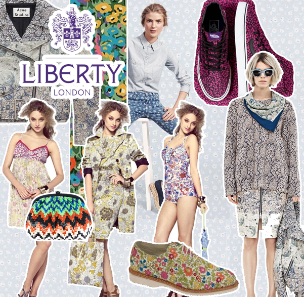
liberty london inspired fashion design collection teen fashion designer I couldn’t do this blog post without a bit of inspiration, so here a few pictures of previous collaborations in which Liberty have done! My favourite collaboration is probably the ones they do with Nike, and of course that collaboration they did with Dr Martens. With my designs I obviously had to do a print because Liberty basically means ‘print’ in the language of fashion. I also love the Vans collaboration as it was so bright and colourful. I wanted to definitely make sure that I infused my love of colour into the collection I made, and I hope I did it justice!

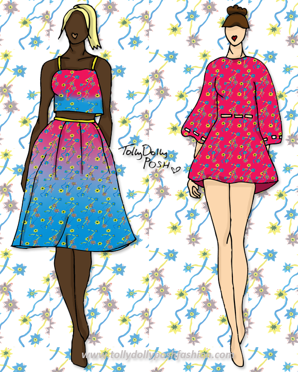
liberty london inspired fashion design collection teen fashion designer Hot Pink & Bright Blue Floral Print 2 Piece (left) and Hot Pink Kimono Dress with Cutouts (right):

For the collection I needed to make sure that I included classic pieces but also incorporated fun elements that I would wear. I absolutely love two pieces at the moment, especially with a cropped top and long puffy skirt. I honestly want this to be made for me. As soon as I can, I’m going to get that fabric printed and make it up! I created the print by doing a water colour doodle and then making it a bit brighter on Photoshop! I really love the way it came out actually, and even though it’s not Liberty print standards, I think it is still nice and quirky. I’m also loving floaty dresses, and this ‘Kimono Dress’ is sooo pretty in my opinion! It would be a light floaty fabric, maybe a crepe sort of style. It would have cut outs around the waist and sleeve for a little something something!

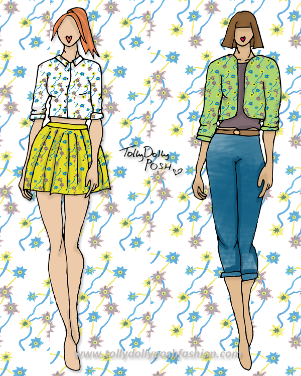
liberty london inspired fashion design collection teen fashion designer White & Neon Mustard Floral Two Piece (Mini Shirt & Skirt – left) and Green Floral Bomber Jacket, Jeans & Taupe T-Shirt (right):

Ah my days! I probably sound really big headed, but I’m really annoyed I did these designs because I love them SO SO much! I think the white and neon mustard colour combination is so gorgeous! I love how the blue pops against both of them, and the style of the shirt is just perfect. For the other look, it is definitely more casual. I think a bomber jacket is such a nice casual way to look sporty, because it isn’t too much. The jeans would be a skinny boyfriend hybrid, so a bit chunky, but not too chunky that they look silly on some people, and skinny enough that they are perfect for all seasons.

Catwalk Song: Movement – Feel Real
Models: Suvi Koponen, Vanessa Axente, Anais Mali & Tilda Lindstam

I hope you liked this post! I am actually pretty proud of the outcome of this! I am definitely going to try and do more of these posts, it’s just they take a bit more time than any other!
Don’t forget you can nominate my blog as Best Teen Style Blog here, which would make me very happy!

You Might Also Like

Designs: Appliqué & LFW Inspired

By February 18, 2014 Designs

Howdy! It has been yonks since I last did a design post and I know you guys love them, so sorry! These posts do take a lot longer to create than other posts so that is why there was a delay, but here I am now! This collection is partly inspired by my Appliqué post and also some of the collections from London Fashion Week.

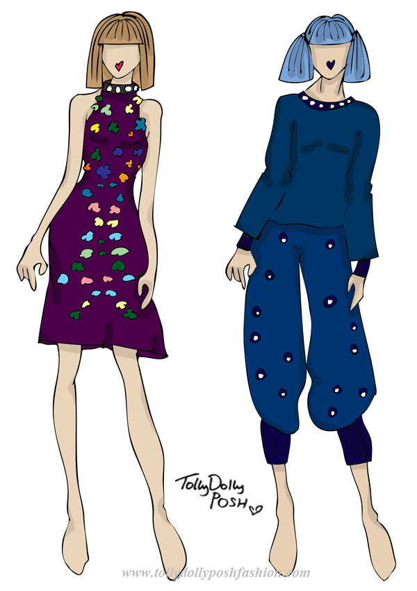
appliqué london fashion week fashion design collection, teen fashion designerPurple Halter Neck Dress with Appliqué & Bead Detailing (left) and Batwing Top and oversized Hareem Trousers with Bead Detailing (right):

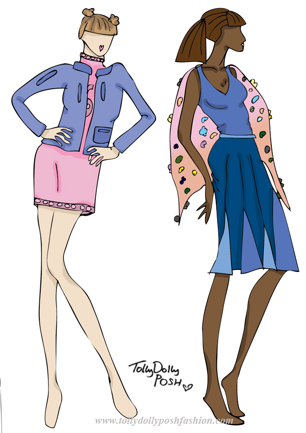
On the catwalk this LFW, I saw a lot of halter necks, so this dress is definitely inspired by some of the collections. I also saw a lot of symmetrical detailing, so the appliqué on this dress is also inspired by LFW. I think the symmetrical detailing is actually quite flattering to the figure too! Another thing I picked up from the shows were the ‘Chanel-esque’ bead detailing on neck line and hems, so I added that to the neck of this dress. The top and bottom on the right are inspired by the bagginess of some collections I saw. The slouchy fit and pyjama type style is something I wanted to come across, but also with a bit of detailing and appliqué. The fabric would be a jersey fabric so comfort would be key. appliqué london fashion week fashion design collection, teen fashion designerKnitted Turtle Neck Dress with Appliqué Detail & Blue Leather Bomber Jacket (left) and Blue Vest with Mixed Blue Panel Skirt & Sheer Cape with Appliqué Detail (right):

 I really liked the use of pastels for A/W 15′ so I thought I would interoperate that into these designs. The knitted dress would be a soft knit, with a pink appliqué ‘sport’ detailing like a number. The bomber jacket would be quite vintage looking in a nice blue but with darker blue detailing on pockets and zips. Retro, but with a modern twist. The other design is inspired by a lot of panelling I noticed. This skirt is very flattering and the mix of blue colour makes the movement of the skirt look awesome! The cape would be sheer with 3D flowers as again, they were all of the catwalks.

I hope you liked this short but sweet blog post! I’m going to start to learn a lot more fashion-y things soon so hopefully these posts should start to improve! But for now, enjoy!

You Might Also Like

Lazy Oaf Inspired Design Collection

By November 29, 2013 Designs, Fashion

Hello! I’m really excited about this blog post! Don’t get too excited, I’m not working with Lazy Oaf (…although, I wish I was!), but I love the brand so I thought it would be cool to create a Lazy Oaf inspired design collection, as if I was collaborating with them. I hope you like them, and if you do, make sure you tweet this, and maybe, just maybe, Lazy Oaf might see it! 😉 Oh, and Lazy Oaf (or anyone else), please do NOT pinch any of my ideas! Please! 😉

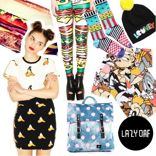
lazy oaf fashion designer teen fashion designer illustrations fashion design ideas collaborationI thought it would be nice to do a sort of mood board so you can see what feel I was going for. Lazy Oaf are like the God of funky prints, modern pop art, food on clothing and just anything awesome. I wanted to take their love of prints, and also their love of shirts and combine them in my own way. My first thoughts were ice cream, and I wanted to do 4 seasons of ice cream. The classic ice cream and Flake would be for Spring, the melting lollipop for Summer, a pumpkin ice cream for Autumn and the ice cream stuck on a tongue for Winter. Unfortunately I had to go with the 3 seasons of ice cream because the Autumn one didn’t work out so well, but none the less I hope you like my little ideas!

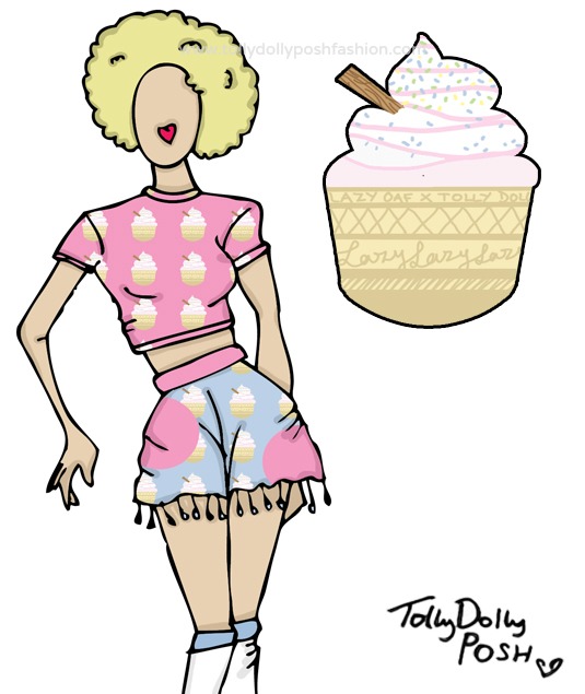
lazy oaf fashion designer teen fashion designer illustrations fashion design ideas collaborationSpring/Summer (Ice Cream): Pastel Pink Ice Cream Print Crop Top & Pastel Pink and Blue Ice Cream Print Spot ‘Skort’ with Pom-Pom Trimming 
I really like this because the pastel colours just add that perfect base for all things Spring. I also love how they are quite subtle, but they bring both the top and ‘skort’ to life. The top would be cropped with short sleeves and a high neck line, giving it that 90s, retro feel, which I think Lazy Oaf are all about. The ‘skort’ would have a pom-pom trim which just adds that little bit more texture and layers to the piece, and I think that is what Lazy Oaf often do. I think you could make some really nice outfits from these pieces, whether you like pink, or you just love anything retro! I also love how the ‘skort’ could be used as a piece of beachwear.

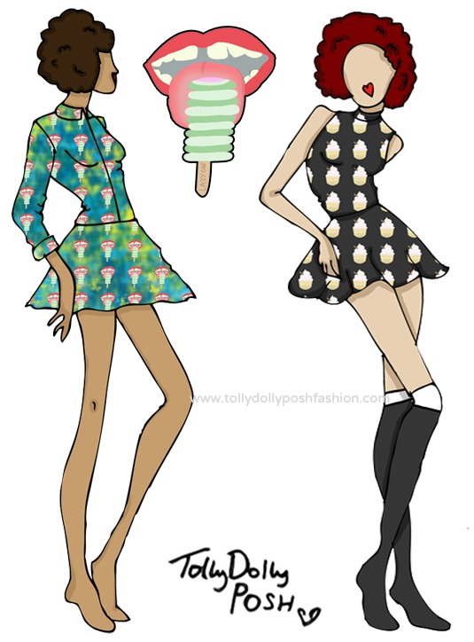
lazy oaf fashion designer teen fashion designer illustrations fashion design ideas collaborationAutumn/Winter (Frozen Tongue – left): Green and Blue Tie Dye Blouse and Skirt with Frozen Togue Print. Spring/Summer (Ice Cream – right): Charcoal Black Polo Neck Top and High Waisted Skater Skirt with Ice Cream Print 
These are my two favourite designs because I think they are classic Lazy Oaf. I love how on the blouse and skirt (left), the Frozen Tongue print just pops against the green and blue tie dye. As I said, Lazy Oaf love using shirts with prints, so I had to include one, and I think this one is perfect, and because it has the green in there, it really fits in with the A/W feel. You could pair the two together, or you could wear it is separately, which I think any collection needs to offer. With the top and skirt (right), I think they would be perfect for all seasons because you could easily layer them, and the ice cream print again, just adds that perfect extra boost for a new layer and dimension.

lazy oaf fashion designer teen fashion designer illustrations fashion design ideas collaborationAutumn/Winter Menswear (‘I Scream’): Charcoal Black and White Top with Lazy Oaf in Pink and I Scream Text & Charcoal Black Beanie Hat with Embroidered Melting Ice Lolly and I Scream Text 
I think I had to include some menswear in this mini design collection, because the Lazy Oaf guys are ‘stylish’ haha! I think that these pieces are very ‘Lazy Oaf Guy’-ish (lol)! The top would have Lazy Oaf on the front filled in with the Frozen Tongue print, and would have patches of ‘I Scream’ text on the hem and sleeves. The beanie would have embroidered ‘I Scream’ text and the 2 embroidered Melting Lollies, which I think is a nice contrast between Summer and Winter.

I hope you liked this little design collection, and if you did, please please please leave a comment, or tweet it because wouldn’t it be fabulous if Lazy Oaf saw it?! Urmm.. yes! Thank You 😀

You Might Also Like

A-Z Fashion Designers: Azzedine Alaia

By September 14, 2013 Fashion

So, um… yeah. Do you remember when I tried to start a series called A-Z Fashion Designers? I started with Adrian Adolph Greenberg… and ended with… Adrian Adolph Greenberg? Yup, well I’m going to attempt to do it again… I cannot promise that I will end on a Z, but I can promise that I will get to a B…. aha. WOW, long intro, let’s just get into it…

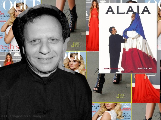
azzedine alaia

Name: Azzedine Alaia (عز الدين عليّة)
Born: Tunis, Tunisia on June 7th 1939 (Age 74)
Education: École des Beaux-Arts
Occupation: Fashion Designer (obviously)
Celebrities seen wearing:  Grace Jones, Tina Turner, Madonna, Janet Jackson, Naomi Campbell, Shakira, Miley Cyrus and also, Rihanna.

Alaia or, Alaïa, was born in Tunisia. His twin sister, inspired him to become a designer. Alaïa lied about his age to get into the École des Beaux-Arts where he studied sculpture. After studying at the school in Tunis, he worked as a dressmaker’s assistant, which led to him dressing private clients. In 1957 he moved to Paris to work on fashion design. He worked as a tailor at Christian Dior and then Guy Laroche and soon afterwards, Thierry Mugler, after which he opened his very own atelier in the late 70s. He produced his first ready-to-wear collection in 1980 which awarded him with Best Designer of The Year and Best Collection of the Year at the Oscars de la Mode in 1984.

His career kicked off after Melka Tréanton of Depeche Mode and Nicole Crassat of French Elle, featured his works in their magazines. In 1988 he had opened his own boutiques in New York, Beverly Hills and in Paris. His ‘sexy’, clinging clothes were a great success and the media named him, ‘The King of Cling’. After his sister passed away in the mid-1990s, he came quiet in the fashion world, although he did carry on working for private clients. In 2000, Prada took him under his wing.

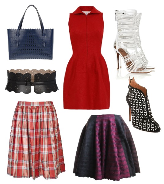
azzedine alaiaZig Zag Skirt//Bag//Belt//White Strappy Heels//Check Skirt//Dress//Lasercut Heeled Boots

These are some of my favourite pieces available at the moment. The zig zag skirt is right up my street, because it’s scalloped, multi coloured, and just utterly gorgeous. It’s simple yet chic, and I like it. A lot. The bag is actually quite nice too! Not usually something I would normally like, but I think it would be a nice bag for work or travelling to hold everything! This belt is really nice too (I’m gonna’ say that about everything haha), and is perfect for A/W! The heels are not particularly me, but I thought I would include them because I saw some ‘dupes’ by The Whitepepper, and now I love them even more. Gahh. I also love this check skirt because it would be good for all seasons. The red dress just looks like it would be really nice and flattering and the boots are quite interesting, but again not particularly my favourite ever.

I hope you liked the 2nd instalment of this series, and I do promise I will try and at least get to B, but I’m not sure about Z… Have you been watching LFW Live Streams? I’m loving the collections! I can’t wait for Sunday, think, Mulberry, Topshop Unique & Paul Smith. Uh huh. Mulberry shows always make me feel special because of my mum (she used to design for them), even though it was before I was born, even before my sister was born in fact, but yeah it still makes me smile 🙂 I’m a lucky ducky having a talented mumma! #SoppyMoment Hehe, oh well, just letting it all out! Haha…

(Information found via Wikipedia.)

You Might Also Like

S/S 13 Mini TDP Design Collection

By March 24, 2013 Designs, Fashion, My Style

*Deep Breath* After yesterday’s excitement of being on BBC Radio 4 (click the link to listen), I thought I would post a few designs. I haven’t posted any designs in a while, I’m sorry. I’ve been so busy recently, but now I have had a few moments to just chill, do some drawings, and show them to you! I decided to put together a ‘Mini Design Collection’ for S/S 13. It includes 5 designs, which I think would be perfect for Spring time!

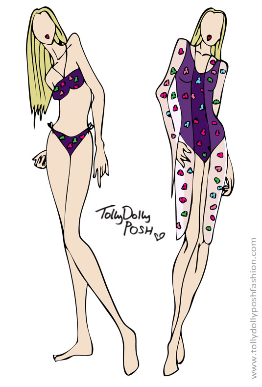
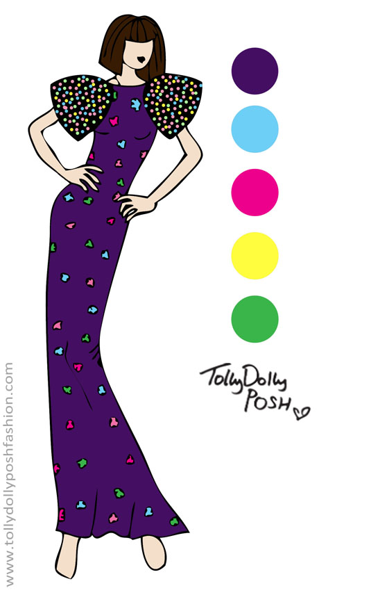
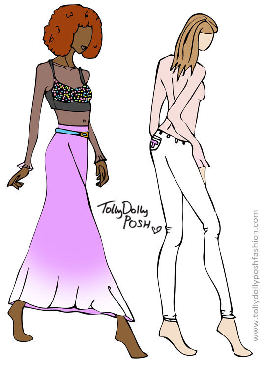
SSdesign1BATHING SUITS & COVER UP: I really love mixing purple and bright colours together, because purple isn’t that dark, but it is sometimes quite hard to make it look right. I think adding a mix of florals to it, is one of the ways to make it look fabulous! I didn’t go with the classic triangle bikini top because I believe that they aren’t very practical. Especially for smaller girls who perhaps don’t have the biggest of… well, you know where I’m going. I also think the ‘bandeau’ style is more comfortable, and will also look great with a cardigan and a pair of shorts. For the one piece, I went for a classic style, but with the same print, because I think it’s good to have 2 of everything but in slightly different styles in your closet, then if you feel like covering up a bit more, you can with the costume! Speaking of covering up, I don’t know whether you can see but on the right, there is a pale lavender see through cover-up on top, again with the floral print. I want the flowers to be more opaque, so that they stand out more. (I admit, this may not be perfect for the weather at this precise moment. Unless you want to turn into an ice cube…)ssdesign2SEQUINS, OMBRE & WHITE JEANS: My first design I posted to you, I included a yellow maxi shirt, which a lot of you really liked (Thanks!), so I decided to do another one, but a ombre version. I really want this pinky/purple to be my classic ‘TDP’ colour. I have also added the belt the same but in a blue, which ties up with the bralet. I was thinking of keeping it just the bralet and the skirt, but I decided that I would add the same pale lavender see through fabric, as a top underneath. The bralet is covered in coloured sequins which I think could either be worn with a leather jacket, or as a nice piece for the beach. On the right, the same see through top is used, you may think its opaque because of the skin tone, but it is the same. The trousers would just be plain white denim, with the ‘T’ initial on the back pocket. This may look like a very basic design, but if I were to do more detailed drawings, I would try and include a little surprise which would make it extra unique.SSdesign3FLORAL & SEQUIN SHOULDER DRESS: This would be my more ‘exciting’ design of the mini collection. It mixes together all of the designs. The floral print makes it great for an evening dress, but I would make the shoulders detachable, so it would also be great for casual wear. The sequin shoulders mean they match the bralet, and also add a bit of glitz to the design. You have to have glitz! If I were to choose a celebrity to wear this at an awards, I would probably choose, Kelly Osbourne, because I think she would really suit it!
(By the way, I know that the colour swatches look like they have just come from a test page of a printer) Haha 😀

If I were to choose the make-up for the collection, I would go with a blue and green smokey eye, and a really nice blush colour. On the lips I would go for a really sheer and glossy coral colour, and with the hair, I would go for all of the above styles! For music I would go for Icona Pop – I Love It. It’s so catchy, and it has a really good feel to it!

 VIEW ALL MY OTHER DESIGNS HERE

It would mean so much to me if you did NOT use these designs for your own use. I spend time and effort drawing each of these by myself. If you’d like to feature them for any particular reason please get in touch, through the Contact page. Thank You.

Again, if you missed my interview on BBC Radio 4 you can listen to it by clicking this link! It was an amazing experience and I’d like to thank BBC Radio 4, so so much!

If you feel my blog deserves it, please nominate it as ‘Best Teen Blog‘ in the Company Style Blogger Awards. Please use the URL: http://www.tollydollyposhfashion.com Thank You! (Nominations close on April 10th)

You Might Also Like

Case-App Personalised iPhone Case*

By March 17, 2013 DIY & Lifestyle

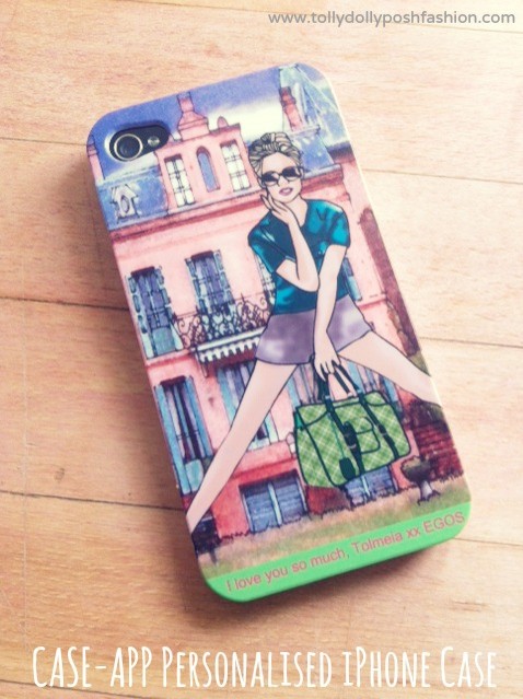
Let’s get straight into it… I love iPhones. My whole family do really, they’re handy, they are a nice size, but most of all, you get to make them look all pretty! I have an iPhone 3, which is very slow and weary at the moment, and I do like giving a bit of loving care with a case, but seeing as it was Mother’s Day not long ago, I gave my mum an iPhone case! She used to have a glossy one which was chipped and broken, and was getting a bit tired, so I decided that she needed to change it up! Case-App allows you to add any pictures you like, text you like, and shapes etc that you like to a case! You can put a couple of pictures or just one, it’s up to you! It’s Fashion for your iPhone!

photo 1My mum or ‘Mama Posh’ is a very artistic person, and is also a former Mulberry accessories designer (Pretty cool, huh?), but at the moment she does illustrations including this one above! I thought it would be really nice if she could showcase her work in a different way, and it looks great! The finish is matte but parts of the detailing are a bit more shiny, which creates a more ‘textured’ feel. The colours are perfect and came out just how I wanted them to! I also added a short message at the bottom which I think adds and even more personal touch. (If you want to know what EGOS means, well, you can’t, it’s a secret! Mwah ha ha ha) You can add what ever colour font you’d like and choose from a selection of different coloured backgrounds like the green at the bottom.

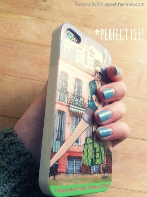
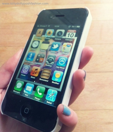
photo 2 photo 3It fits really well and you can be sure that it won’t come off! That was sort of a problem when I tried it on Papa Posh’s iPhone, as it took a bit of fiddling, but I don’t think that is a major issue. As you can see the sides are plain white, which I wasn’t quite sure about, but looking at it now, I think it makes it look a bit smarter than having coloured sides. It doesn’t have any protection on the front, which I like as it means you don’t have to worry about it getting dirty, or it fading where you hold it. Overall it looks really nice and this is what my mum said about it….

”I think it is exceptionally good quality and the detailing on my design is fabulous. The colours are exactly how I’d like them, and it is great seeing what my illustrations would look like on a phone. I think it is well worth the money, and I would rate it 10/10. Well Done Case-App!”

That is all true, she actually said that all! I would totally agree, it is really a good quality case, and I am so glad that I decided to give it to her, as it put a smile on her face! I think it would be a really good present for anybody, and even a nice treat for yourself, and your iPhone! You can get a Case-App Personalised iPhone Case for any iPhone 4/4s or iPhone 5 from the Case-App store! Plus… it’s free delivery! AND, you can get 20% off with the the code ‘TOLLY’ at the checkout! 

(This is a * marked review. I am very grateful that Case-App gave me an iPhone Case to review. All opinions are 100% honest, including the mini review by Mama Posh! ‘We’ wouldn’t lie to you – would we? I wish Case-App the best of luck this year.)

If you believe I deserve it please nominate my blog as the ‘Best Teen Blog‘ in the Company Style Blogger Awards. Use the URL: http://www.tollydollyposhfashion.com Thank You.

You Might Also Like

TDP Designs: #1

By January 16, 2013 Designs

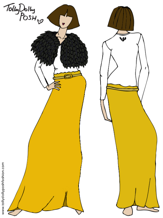
tdpdesign1aHere is my first design on my blog! It is hand drawn and then put through Photoshop! I hope you like it! This look was inspired by when I was feeling down, and my dad said to me to think up a dress under ‘Sunflowers In My Heart’. The black feather cape is the center of the sunflower, and the long maxi skirt are the yellow petals, so it’s kind of the other way round, but I like it like that!

Find all my designs here!

You Might Also Like

Valentino New 2012 Autumn Collection Sneak Peek

By July 14, 2012 Fashion

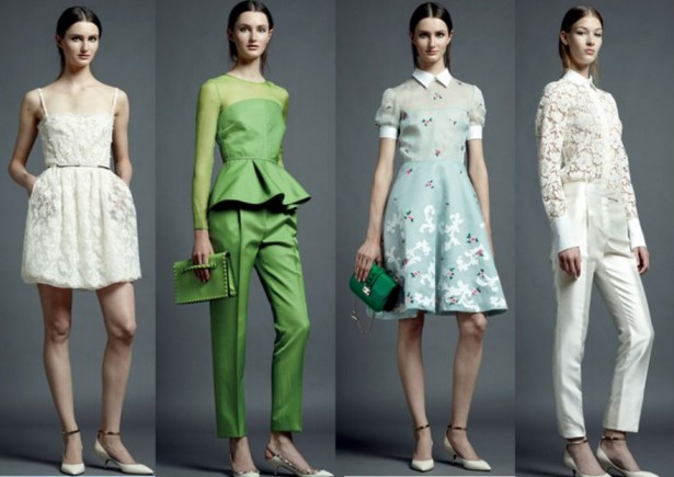
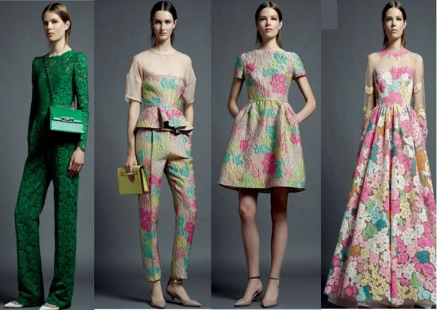
Oh. My. Gosh! I was browsing around, and found the new Valentino Autumn Collection! It is sooo nice! I am fortunate enough to own a real Valentino bag, which I couldn’t believe was real myself! Now looking at this had made me think, ‘I HEART VALENTINO!’. Take a look yourself… I must say, this collection is like the Holy Bible of an Autumn Collection! (Sorry about Picture quality!)

Valentino Autumn Collection Pre-Ready To Wear 2012 (Pictures found via Vogue)


Valentino Autumn Collection Pre-Ready To Wear 2012 (Pictures found via Vogue)

My favourite, has to be the Green Peplum Top & Trousers. That outfit is gor-ge-ous!

Some interesting news about Valentino, is that it was bought out this Thursday by the Royal Family of Qatar for a reported £550… Million! It is the second renowned Italian design firm, to be bought out by the Gulf’s investors. The company’s founder – Valentino Garavani –  signed his last collection in 2008, and 10 years before that he had sold the company for £195m, to an Italian conglomerate. The work of ‘Valentino’ are now in the hands of Maria Grazia Chiur & Pierpaolo Picciolo, who worked with Garavani before his retirement.

For more info visit the Guardian.co.uk


You Might Also Like