Tolly Dolly Posh Fashion
Tolmeia Gregory New Site
Browsing Category

Designs

One of my biggest dreams is to become a fashion designer so here are just a few of my designs and doodles…

Illustrated Designs: Practicing Repeat Patterns with Watercolour

By July 30, 2016 Designs

It’s been a while since I’ve posted some designs on here. I’m pretty much a perfectionist so I only ever like to share things that I’m genuinely happy with or I at least think are worth sharing. After fiddling around and practicing my watercolour painting techniques and watercolour repeat patterns, I doodled up a quick one and was set a small brief to draw up some rough ideas to make them come to life… and they’re worth sharing, I suppose! Plus, it was totally an excuse to try out the illustrative style I’ve fallen in love with…


© Original designs by Tolly Dolly Posh. More info here


watercolour repeat patterns illustrated fashion design

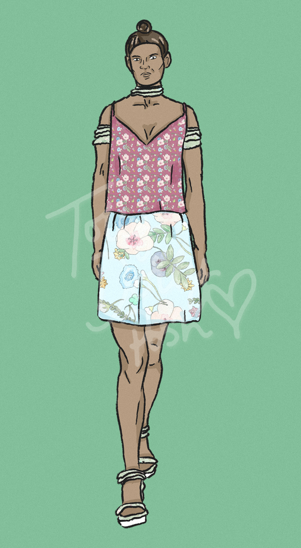
~ LOOSE V-NECK CAMI & JERSEY PRINTED SKIRT ~

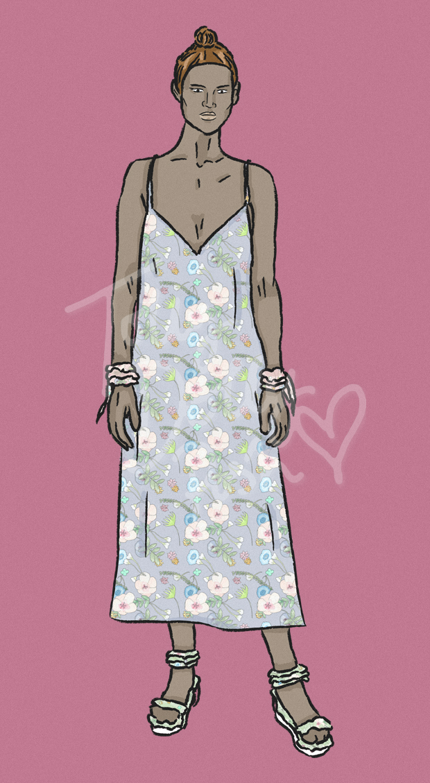
The brief was to sketch up some simple items that could be easily cut and put together, and my first thought was loose and unfitted. I personally love layering, so most of the low-cut v-neck items in this blog post are ideally meant for that purpose. A ditsy floral print would work really well, especially if layered over a contrast blouse or shirt. It genuinely would be a straight up and down cami with the only detailing being the deep neckline, making it a simple throw on and throw away piece (by throw away I mean, into your drawers).

The skirt would be a thicker jersey material, in a simple circle skirt/A-line fit. Stretchy and comfortable, but thicker than the more silk like cami to match. I love experimenting with different colour ways and print scales, hence why the skirt and top mismatch. The addition of the ruffled arm cuffs and collar are based around the seasonal trends at the moment, which are also in a mixmatched colour way.
watercolour repeat patterns illustrated fashion design

~ LOOSE V-NECK MAXI DRESS ~

Another flowing v-neck design in a powder purple. Similar in shape to the cami already mentioned, it’s simply straight up and down and due to it’s extremely relaxed and loose nature, has no zips or buttons as it can be taken on and off with ease. I understand that it looks like a rather daring neckline, but once again, it’s intended for layering, but for these sketches I didn’t want to take away from the main idea.
watercolour repeat patterns illustrated fashion design

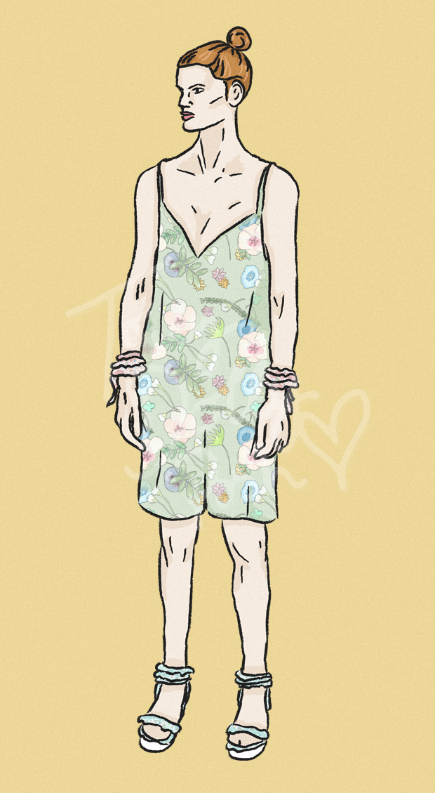
~ LOOSE V-NECK PLAYSUIT ~

Almost identical to the maxi dress, this playsuit is again just straight up and down and simple; the fabric being loose enough for a no-zip access. It’s a rather ‘boyish’ fit, with lots of room in the legs and body for movement not only for the wearer, but also for the fabric. A slightly bigger print scale allows the green to contrast against the darker greens within the print, and adds for a more camouflage, botanical feel.
watercolour repeat patterns illustrated fashion design

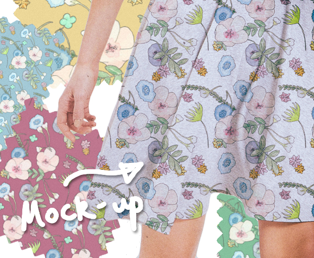
~ MOCK-UP DESIGN (Original item via People Tree) ~

I also wanted to do a quick mock-up using an ‘already in production’ item as it gives you a real sense of how the print would work with certain fabrics. You an also see the print a little closer up here. It’s a combination of large flowers and foliage, with scattered leaves and small daisy like flowers. The colours could easily be adapted for a more autumnal feel, but with the blues included, I could see this piece going into winter too.

I hope you liked this quick little insight into some recent rough designs! You guys requested for me to post some more of these illustrations, so I thought I’d give you just that! I put a quick poll out on Twitter (closed now, I’m afraid) to see if you’d be interested in seeing daily illustrations over fashion week instead of general reviews, and the answer was definitely a yes to illustrations! I’ll let you know how that goes and if I stick to it!

(Reference images)


Would you wear any of these designs? Which is your favourite? Let me know in the comments!
 

You Might Also Like

NEW Fashion Designs & An Update

By October 14, 2015 Designs

Hello! *cough cough* No, that isn’t a way of adding a remark in here, it’s actually me coughing as I type. Unfortunately I’ve been under-the-weather the past few days with a cold so my blog has been a little bit behind! I’ve mainly spent my days tucked up in bed re-watching Community because seriously – #ANDAMOVIE? But now, I finally have a new post for you in the form of two new designs… enjoy!

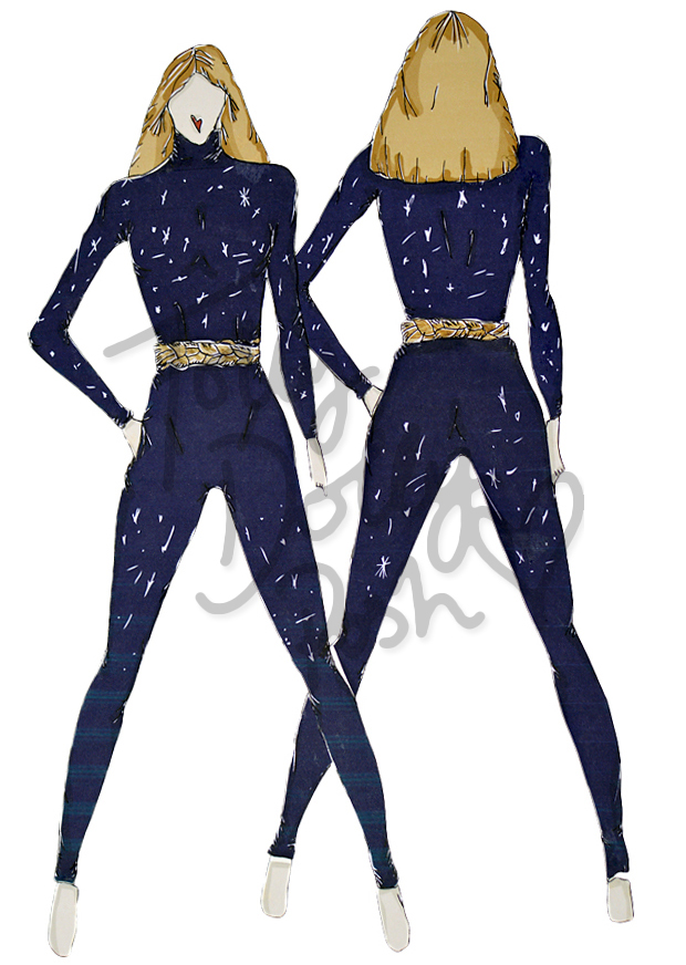
Space Inspired Fashion Designs - Teen Fashion Designer - Tolly Dolly PoshSpace Inspired Fashion Designs - Teen Fashion Designer - Tolly Dolly Posh

Space Inspired Fashion Designs - Teen Fashion Designer - Tolly Dolly Posh

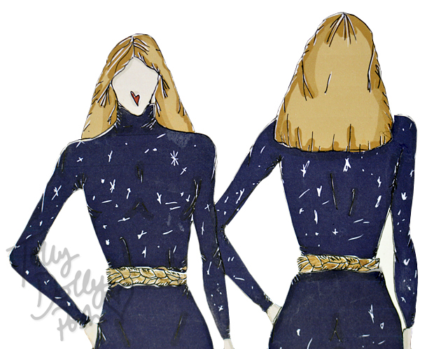
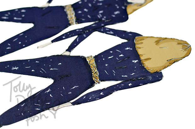
~ EMBROIDERED JERSEY TWO-PIECE & TWISTED ROPE BELT ~~

My first ideas for these designs was to think about ‘letting go’ because I’ve been trying to do a lot of that recently. Sounds weird, huh? I mean like, letting go of TV shows because I tend to get rather hooked and letting go of little things that can get me all worried and stressed. So with that thought I realised that letting go isn’t all about being loose and free (you might be thinking of loose flowing fabrics?), it’s also got a lot to do with keeping things close. Hence, this rather tight fitting jersey two-piece.

On the contrast, the embroidery is inspired by the stars which I personally look to when trying to let go of all the little things (well I mean, you won’t catch me star gazing to try and forget Community…), because it reminds me how small we really are… ahhh. The rope signifies both holding things close, and the opposite, because within a moment of untying a knot, you can let things go.

Space Inspired Fashion Designs - Teen Fashion Designer - Tolly Dolly Posh Space Inspired Fashion Designs - Teen Fashion Designer - Tolly Dolly Posh

Space Inspired Fashion Designs - Teen Fashion Designer - Tolly Dolly Posh

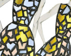
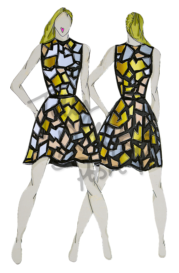
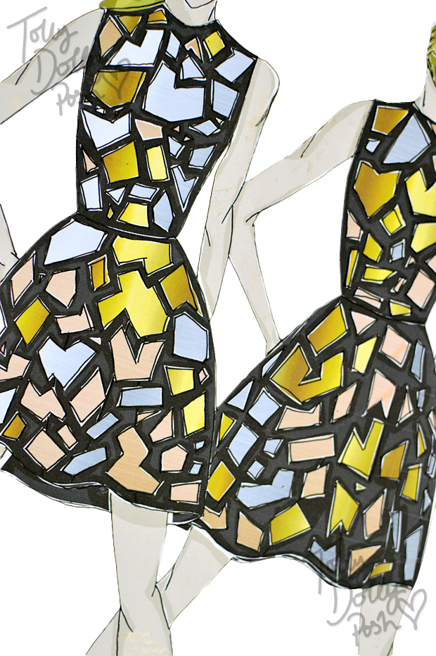
~ STRUCTURED SCUBA DRESS WITH MIXED METAL (PLASTIC) SHARDS ~

It was when I was doing this, that I realised that the two designs actually match very well. I was creating this idea of the little pieces of life that don’t fit together when I realised that the idea in my head actually sort of looked a bit like space ‘rubbish’. All the satellites and debris floating around the earth… it worked with the stars. All the pieces that we as humans let go of without even really thinking about (I mean, NASA do of course but when was the last time you thought of space debris?).

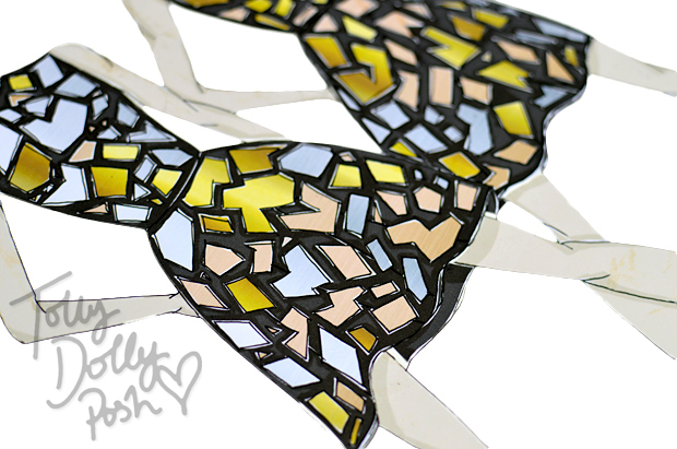
The shards would be attached liberally in three different tones of metal (they’d be plastic but with a metallic coating); copper, silver and gold. It would be quite bulky and perhaps more of a show piece but I think the 3D effect and the layers and tones would make for a really interesting dress. I also love scuba for structure and it would definitely hold the plastic well.


What do you think of these quick fashion designs? Do they fit well with each other? Give me some feedback in the comments! I’d love to know 🙂

I should be back soon with another post, quite possibly a Changing With The Seasons, so stay tuned! I scanned in my final pieces for these designs so that’s why they’re a little different – what do you think? I quite like it. I’ll see you soon people! *cough cough*

You Might Also Like

“La Grotte” Inspired Fashion Designs & Moodboard

By August 23, 2015 Designs

It has been a while since a design post, huh? I find because I’m my own worst critic, that I tend to only want to share work with you that I’m 100% happy with, and that is why my design page may look very empty now… I just need a fresh start and to start showing you things that I’ve actually worked on as proper little projects. Alongside this one, I made draft pattern pieces, and A3 final illustrations (which look a lot better than the digital ones actually)… so there’s a lot more to it than what meets the eye!

La Grotte Lacave Cave Inspired Fashion Designs

La Grotte Lacave Cave Inspired Fashion Designs

La Grotte Lacave Cave Inspired Fashion Designs

~ THE INSPIRATION ~

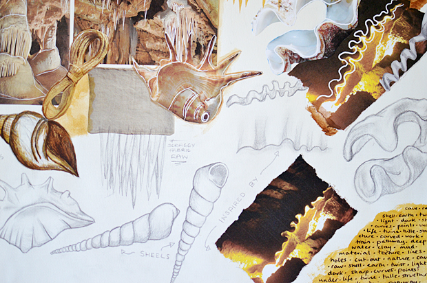
With the designs that I’ve done more recently, I’ve really tried to take inspiration from anything to get my creativity flowing, and this time I took to the underground French caves! We’ve visited a few when we’ve been over and they really are quite fascinating, and full of different shapes and textures. The main inspiration was this weird wavy crevasse that I saw above our heads and it spiralled into lots of different ideas.

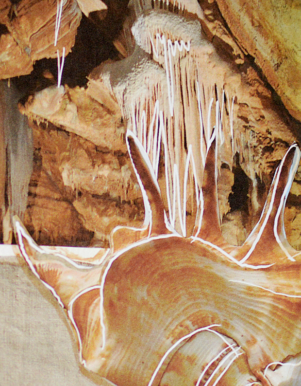
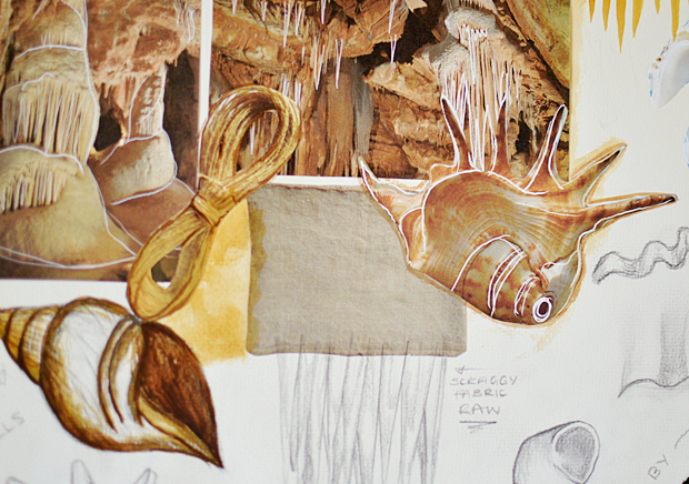
My moodboard is rather small but it actually really helped in thinking up the smaller details for my mini design “collection”. I also realised that the stalagmites reminded me of certain shells with their curves and pointed edges. I also discovered a cool method to highlight inspiration by drawing over with white in Photoshop.. I really like the effect!

La Grotte Lacave Cave Inspired Fashion Designs

~ TULLE DRESS ~

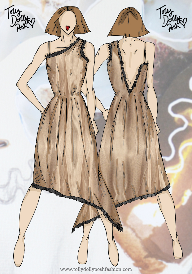
The jagged edges from the caves reminded me of the amazing use of raw and jagged tulleso I drew up a little dress featuring smaller details like messily folded and pleated hemming and drop back that looks like a crevasse it’s self. The idea is that it would be gathered at the waist but fairly loose and full in the skirt. As tulle is so light it would need several layers and a lining to really bring it altogether.

The dark black pleated detailing reminds me of the deep shadows that are created from artificial lighting deep underground. The pleats would be messy and uneven to create that jagged effect.

La Grotte Lacave Cave Inspired Fashion Designs

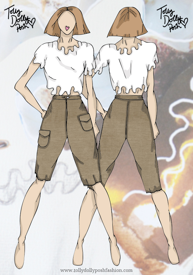
~ SILK TOP & BURLAP (TWINE) LONG SHORTS ~

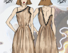
For the next “look” in this mini collection, I decided to use silk on top. After connecting the dots between the shells and the cave, I decided to draw up a floaty and boxy silk top that would have looping curves around the neck, arms and hem line to remind me of the inside of a clam or the smooth water that dripped below the ground. There would be covered buttons on the back with a tab opening also, I just didn’t include it in the basic design! 

For the long shorts, they would be a lined pair of raw, burlap material. I call it twine but it’s probably the complete wrong word! They’d hit just on the knee, with the frayed edges almost being a bit of a tickle. The texture and roughness reminds me of the rough cave walls and the big pockets are also a nod to the big drops that plunge into darkness.


What do you think of my cave inspired collection? It’s simple but has a lot of thought in it. Let me know the comments if you’d like to see this style post in the near future!


You Might Also Like

Paris Fashion Week Inspired Fashion Design Sketches

By March 20, 2015 Designs

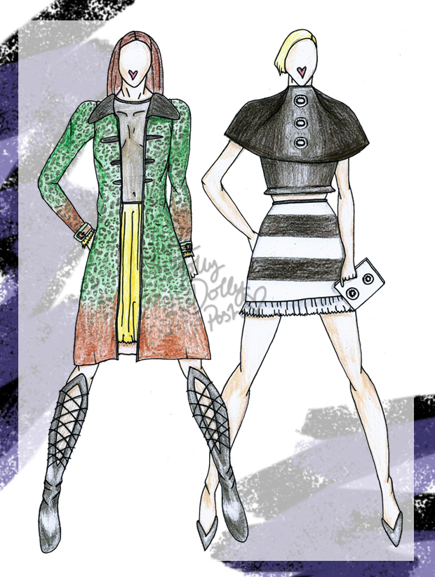
Wow-wa-wee-wah. What a day, huh? First a total eclipse happened in Europe (well, I saw a partial eclipse, but it was still pretty epic) and now a fashion design post? I was actually kind of unsure whether to publish these designs because I personally don’t think they’re great… but then I guess we’re all our own worst critics so I thought I’d leave it up to you to decide! They’re not digital which is something new, and that means imperfections like pencil marks and wobbly lines… but hey ho! Here are a few Paris Fashion Week inspired design sketches 🙂 Let me know what you think in the comments, I’d love some feedback!

Paris Fashion Week PFW Fashion Design Sketches

Red Skater Dress with Sequin Patches & Thigh High Leather Boots…

Over the fashion week period I noticed quite a lot of ‘sexy’ red pieces… yup! Skimpy red mini dresses and plunging neck lines. All very saucy indeed, so I decided to take that and make it my own. A figure hugging skater dress with sequin patches for a hint of glamour. The leather thigh high boots are also quite risqué and feature 2 panels of tight lacing to reveal skin and add to the drama of the look.

Leopard Panel Shirt & Striped Pencil Skirt with Tulle Hem…

I saw quite a bit of leopard print in some of the shows too, specifically at Miu Miu, and it really inspired me for this piece. Combined with another PFW trend of laid-back styles, I think it’s quite a cool combo! The skirt is perfect for tucking the shirt into and compliments the different colour panels. I also spotted hints of tulle down the Parisian runways, hence the cheeky bit of tulle hemming.

Paris Fashion Week PFW Fashion Design Sketches

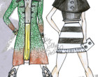
Green and Orange Leopard Coat, Mesh and Tulle Skater Dress & Knee High Leather Boots…

Another Miu Miu inspired piece with this green and orange ombre print coat. The bold print is complimented by the sweet style of the collars and fitted arms. Bold buckles fit together at the cuffs for a more structured look. Underneath is a mesh and tulle skater dress for another touch of sauciness. The skirt of the dress is a thick layered tulle in bright yellow; this is also featured on the cuffs of the dress too! A similar pair of leather boots but instead of two panels, just the one laced panel down the front to elongate the wearers legs. What do you think?

High Neck Cape-Top & Striped Mini Skirt with Tulle Hem…

One trend for AW 15/16 that seemed stronger than ever, was the all-black combination. This look is sort of inspired by lots of different shows but now that I look at it, it does sort of remind me of the Chanel show (such a cool show, set in a Parisian style cafe). The cape-top is a structure piece which looks like 2 separate layers. The bold white buttons have tulle detailing on them which joins in the with the skirt. The skirt of which is a striped mini skirt again with the same tulle hemming. The look would be paired with a white box clutch with the same tulle buttons as on the cape-top.


These designs are my own original ideas and I would really appreciate it if you didn’t publish/use these images without permission. Get in touch if you’d like to use them. 


So yup! Do let me know what you think of these… I’ll try to post more designs but as my days get busier (I’m talking Mooi en Lief by Tolly Dolly Posh kinda’ busy) it’s pretty hard to publish them regularly. Anyhow, I shall be back soon.. watch out, it’s a prom post next 😀

You Might Also Like

Liberty London Inspired Design Collection

By April 8, 2014 Designs

Does anybody remember this post where I did a Lazy Oaf inspired design collection? No? Well check it out before you carry on with this one… what I really mean is, today I have a very similar one! It’s the exact same sort of thing but instead of Lazy Oaf, we have Liberty London! Again… don’t get too excited, I’m not working with Liberty… although I really wish I was *sigh* Please Liberty, do not steal my ideas, or any other brand or person… would make me happy! If you want to be super super awesome, then you can tweet this post and who knows, Liberty might just see it!

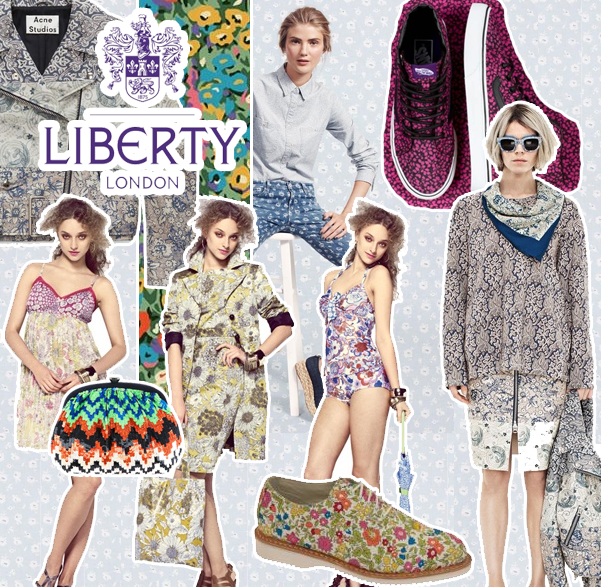
liberty london inspired fashion design collection teen fashion designer I couldn’t do this blog post without a bit of inspiration, so here a few pictures of previous collaborations in which Liberty have done! My favourite collaboration is probably the ones they do with Nike, and of course that collaboration they did with Dr Martens. With my designs I obviously had to do a print because Liberty basically means ‘print’ in the language of fashion. I also love the Vans collaboration as it was so bright and colourful. I wanted to definitely make sure that I infused my love of colour into the collection I made, and I hope I did it justice!

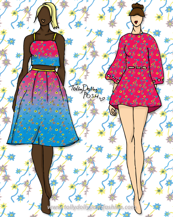
liberty london inspired fashion design collection teen fashion designer Hot Pink & Bright Blue Floral Print 2 Piece (left) and Hot Pink Kimono Dress with Cutouts (right):

For the collection I needed to make sure that I included classic pieces but also incorporated fun elements that I would wear. I absolutely love two pieces at the moment, especially with a cropped top and long puffy skirt. I honestly want this to be made for me. As soon as I can, I’m going to get that fabric printed and make it up! I created the print by doing a water colour doodle and then making it a bit brighter on Photoshop! I really love the way it came out actually, and even though it’s not Liberty print standards, I think it is still nice and quirky. I’m also loving floaty dresses, and this ‘Kimono Dress’ is sooo pretty in my opinion! It would be a light floaty fabric, maybe a crepe sort of style. It would have cut outs around the waist and sleeve for a little something something!

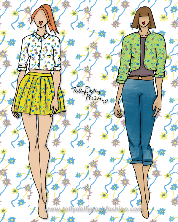
liberty london inspired fashion design collection teen fashion designer White & Neon Mustard Floral Two Piece (Mini Shirt & Skirt – left) and Green Floral Bomber Jacket, Jeans & Taupe T-Shirt (right):

Ah my days! I probably sound really big headed, but I’m really annoyed I did these designs because I love them SO SO much! I think the white and neon mustard colour combination is so gorgeous! I love how the blue pops against both of them, and the style of the shirt is just perfect. For the other look, it is definitely more casual. I think a bomber jacket is such a nice casual way to look sporty, because it isn’t too much. The jeans would be a skinny boyfriend hybrid, so a bit chunky, but not too chunky that they look silly on some people, and skinny enough that they are perfect for all seasons.

Catwalk Song: Movement – Feel Real
Models: Suvi Koponen, Vanessa Axente, Anais Mali & Tilda Lindstam

I hope you liked this post! I am actually pretty proud of the outcome of this! I am definitely going to try and do more of these posts, it’s just they take a bit more time than any other!
Don’t forget you can nominate my blog as Best Teen Style Blog here, which would make me very happy!

You Might Also Like

Designs: Appliqué & LFW Inspired

By February 18, 2014 Designs

Howdy! It has been yonks since I last did a design post and I know you guys love them, so sorry! These posts do take a lot longer to create than other posts so that is why there was a delay, but here I am now! This collection is partly inspired by my Appliqué post and also some of the collections from London Fashion Week.

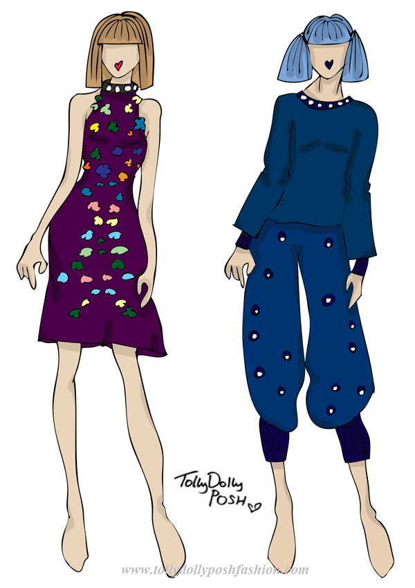
appliqué london fashion week fashion design collection, teen fashion designerPurple Halter Neck Dress with Appliqué & Bead Detailing (left) and Batwing Top and oversized Hareem Trousers with Bead Detailing (right):

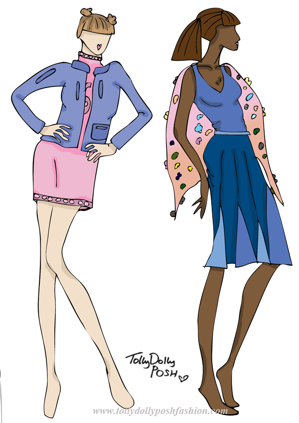
On the catwalk this LFW, I saw a lot of halter necks, so this dress is definitely inspired by some of the collections. I also saw a lot of symmetrical detailing, so the appliqué on this dress is also inspired by LFW. I think the symmetrical detailing is actually quite flattering to the figure too! Another thing I picked up from the shows were the ‘Chanel-esque’ bead detailing on neck line and hems, so I added that to the neck of this dress. The top and bottom on the right are inspired by the bagginess of some collections I saw. The slouchy fit and pyjama type style is something I wanted to come across, but also with a bit of detailing and appliqué. The fabric would be a jersey fabric so comfort would be key. appliqué london fashion week fashion design collection, teen fashion designerKnitted Turtle Neck Dress with Appliqué Detail & Blue Leather Bomber Jacket (left) and Blue Vest with Mixed Blue Panel Skirt & Sheer Cape with Appliqué Detail (right):

 I really liked the use of pastels for A/W 15′ so I thought I would interoperate that into these designs. The knitted dress would be a soft knit, with a pink appliqué ‘sport’ detailing like a number. The bomber jacket would be quite vintage looking in a nice blue but with darker blue detailing on pockets and zips. Retro, but with a modern twist. The other design is inspired by a lot of panelling I noticed. This skirt is very flattering and the mix of blue colour makes the movement of the skirt look awesome! The cape would be sheer with 3D flowers as again, they were all of the catwalks.

I hope you liked this short but sweet blog post! I’m going to start to learn a lot more fashion-y things soon so hopefully these posts should start to improve! But for now, enjoy!

You Might Also Like

Lazy Oaf Inspired Design Collection

By November 29, 2013 Designs, Fashion

Hello! I’m really excited about this blog post! Don’t get too excited, I’m not working with Lazy Oaf (…although, I wish I was!), but I love the brand so I thought it would be cool to create a Lazy Oaf inspired design collection, as if I was collaborating with them. I hope you like them, and if you do, make sure you tweet this, and maybe, just maybe, Lazy Oaf might see it! 😉 Oh, and Lazy Oaf (or anyone else), please do NOT pinch any of my ideas! Please! 😉

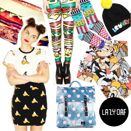
lazy oaf fashion designer teen fashion designer illustrations fashion design ideas collaborationI thought it would be nice to do a sort of mood board so you can see what feel I was going for. Lazy Oaf are like the God of funky prints, modern pop art, food on clothing and just anything awesome. I wanted to take their love of prints, and also their love of shirts and combine them in my own way. My first thoughts were ice cream, and I wanted to do 4 seasons of ice cream. The classic ice cream and Flake would be for Spring, the melting lollipop for Summer, a pumpkin ice cream for Autumn and the ice cream stuck on a tongue for Winter. Unfortunately I had to go with the 3 seasons of ice cream because the Autumn one didn’t work out so well, but none the less I hope you like my little ideas!

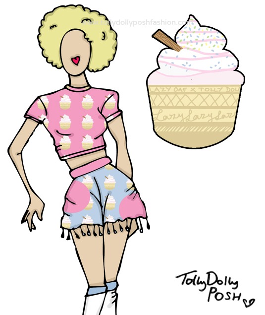
lazy oaf fashion designer teen fashion designer illustrations fashion design ideas collaborationSpring/Summer (Ice Cream): Pastel Pink Ice Cream Print Crop Top & Pastel Pink and Blue Ice Cream Print Spot ‘Skort’ with Pom-Pom Trimming 
I really like this because the pastel colours just add that perfect base for all things Spring. I also love how they are quite subtle, but they bring both the top and ‘skort’ to life. The top would be cropped with short sleeves and a high neck line, giving it that 90s, retro feel, which I think Lazy Oaf are all about. The ‘skort’ would have a pom-pom trim which just adds that little bit more texture and layers to the piece, and I think that is what Lazy Oaf often do. I think you could make some really nice outfits from these pieces, whether you like pink, or you just love anything retro! I also love how the ‘skort’ could be used as a piece of beachwear.

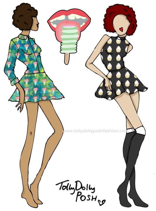
lazy oaf fashion designer teen fashion designer illustrations fashion design ideas collaborationAutumn/Winter (Frozen Tongue – left): Green and Blue Tie Dye Blouse and Skirt with Frozen Togue Print. Spring/Summer (Ice Cream – right): Charcoal Black Polo Neck Top and High Waisted Skater Skirt with Ice Cream Print 
These are my two favourite designs because I think they are classic Lazy Oaf. I love how on the blouse and skirt (left), the Frozen Tongue print just pops against the green and blue tie dye. As I said, Lazy Oaf love using shirts with prints, so I had to include one, and I think this one is perfect, and because it has the green in there, it really fits in with the A/W feel. You could pair the two together, or you could wear it is separately, which I think any collection needs to offer. With the top and skirt (right), I think they would be perfect for all seasons because you could easily layer them, and the ice cream print again, just adds that perfect extra boost for a new layer and dimension.

lazy oaf fashion designer teen fashion designer illustrations fashion design ideas collaborationAutumn/Winter Menswear (‘I Scream’): Charcoal Black and White Top with Lazy Oaf in Pink and I Scream Text & Charcoal Black Beanie Hat with Embroidered Melting Ice Lolly and I Scream Text 
I think I had to include some menswear in this mini design collection, because the Lazy Oaf guys are ‘stylish’ haha! I think that these pieces are very ‘Lazy Oaf Guy’-ish (lol)! The top would have Lazy Oaf on the front filled in with the Frozen Tongue print, and would have patches of ‘I Scream’ text on the hem and sleeves. The beanie would have embroidered ‘I Scream’ text and the 2 embroidered Melting Lollies, which I think is a nice contrast between Summer and Winter.

I hope you liked this little design collection, and if you did, please please please leave a comment, or tweet it because wouldn’t it be fabulous if Lazy Oaf saw it?! Urmm.. yes! Thank You 😀

You Might Also Like

Mini Design Collection: Teen A/W Fashion

By November 2, 2013 Designs

”Honey, I’m home!” – Okay, maybe not ‘honey’ but, yes, I am back! The trip was really nice, fun and exciting (shopping, and new born baby cuddles, what more could you want?), but sadly I am back 🙁 I have a cold, and I miss my sister a lot. But, to get things started again, I’m here with teen a/w fashion design collection! Please excuse any abnormal legs in this collection… aha!

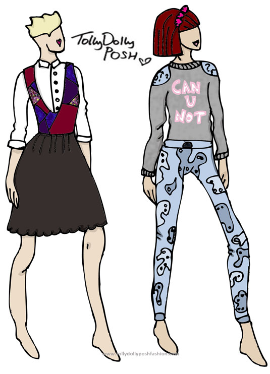
teen a/w fashion design collection teen fashion designerMixed Knit Pinafore Dress and White Blouse (left) & ‘Can U Not’ Marl Sweater and Paisley Print Mixed Denim Jeans (right):

I feel like this dress (left) is a mix between an old man’s sweater (lol), and a waitress’s dress (weird…) but someone how I think it looks pretty cool. I would hopefully make the top part of the dress a knitted part, and then the scalloped skirt either a jersey material, or a chiffon material, I cannot decide! I would also make the top part detachable, because I hate it when the skirt part of a dress is also nice on it’s own! The blouse would be an ordinary white blouse, but with some nice floral buttons. The ‘sweater’ on the right, would be a nice marl fabric, with soft fluffy lining. On the front it has ‘Can U Not’ (one of my favourite sayings at the moment) in a pastel pink colour. As you can see, the shoulders have a blue detailing, which would have a ? (question mark) print. The jeans are a mixed denim paisley print skinny jean. I would want them to be quite skinny, but comfortable so they would fit most teens.

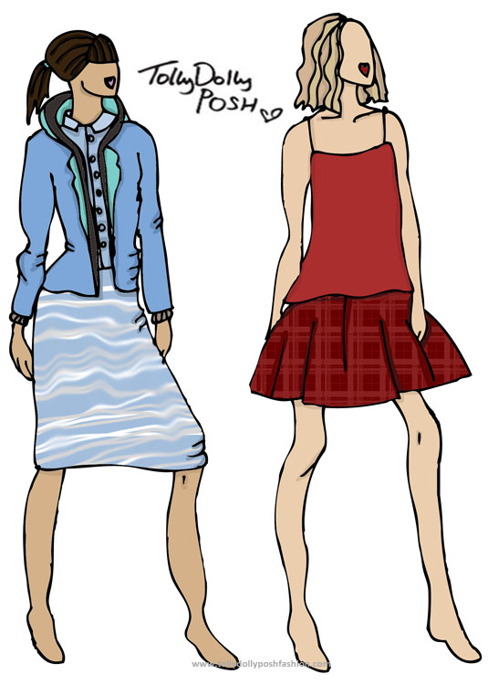
teen a/w fashion design collection teen fashion designerBlue and Grey Hooded Blazer/Jumper, Pastel Blue Blouse and ‘Soundwave’ Print Tube Skirt (left) & Red Chiffon Vest and Deep Red Checked ‘Party’ Skater Skirt (right):

I thought of a jacket which would be perfect for teens, whether it was for just casual use, or for at school (if you don’t have to wear uniform that is), and I made up the perfect of pieces! It’s basically a jersey material blazer, with hood, and a thicker lining, so it keeps the comfort of a hoody, but style of a casual blazer, all in one. The skirt is a tube style, so it comes just to the knee, and the blouse, again is just a plain one, but with the collar in a lighter blue than the shirt itself. The vest on the right, is one of those chiffon-y, lightweight, floaty ones, with skinny straps. The skirt would be a nice thick, but easy wear, skater style, in  a deep red check, to go along with the A/W trends.

I feel like all these designs are very teen appropriate. What do you think? Make sure to leave me a comment down below! Also check out my previous designs here.

**Make sure to check out Let’s See, the awesome photography blog, which I absolutely 100% honestly love! (This is a sponsored link)**

You Might Also Like

Blogger Inspired Fashion Design Collection

By September 8, 2013 Designs, Fashion

Oh. My. WOW. I haven’t done a design collection in yonks. I know I said I would, and I’m sawwwry, okay?! But, I thought this idea would make it a good way to start a fresh? Non? Welcome in my blogger inspired fashion design collection, oh yes!

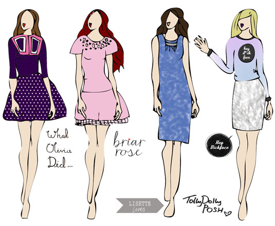
blogger inspired fashion designAll these designs have been based on the blogger’s style. I’ve looked at what they’ve worn and slightly tweaked them. I’m sorry if they are not totally extravagant, but I wanted to really make them wearable for the bloggers.

What Olivia Did:
As you may already know, I love Olivia’s style, and I wanted to sort of, change up a few of the classic pieces that she likes to wear. I’ve made a sailor style collar, but changed it up to a pink colour. I would also make it embellished but it was hard to show on the image above. The skirt is a skater style one in polka dots, I would make it a nice thick jersey style so it has a lot of shape to it.

Briar Rose: 
Again, one of my favourite style inspirations, Megan. I decided to sort of change up the style, by going all out pink, and also using a smock style dress. Megan has the perfect figure for any type of dress style! The neckline has laser cut detail with also a few embellishments around. The skirt is a low waist, and has a nice puffy underskirt. I definitely think Megan could rock this!

blogger inspired fashion design

Lisette Loves:
You might know, that um, I have a slight obsession with this one 😉 in, a *hopefully* non creepy way. Lisette has a gorgeous fashion sense! I decided to take her away from her favourite style of the smock dress, and pop her in a shift dress. A shapeless dress is always flattering, plus denim is too? I know Lisette could accessorise this really well! I would make the dress a nice perfect blue with a slight acid wash effect.

Hey D*ck Face: 
A more recent style obsession, is the lovely lady from Hey D*ck face. Her style is quite quirky but simple, so anyone can try and take a few ideas from her outfits. I decided to do a twist on one of her most recent OOTDs. I’ve made the sweater a purple and pastel blue dip dye colour, with the Hey D*ck face logo.  I also changed up the skirt so it is a metallic texture – so cool. I love the metallic look, and I definitely think she could work it 😉

blogger inspired fashion design

I hope you enjoyed this blog post! Make sure to check out all these lovely ladies, their blogs are amazing! I think I might do another one of these collections? What do you think? Let me know in the comments?


You Might Also Like

Mini Design Collection #3: Keep On Swimming

By July 17, 2013 Designs, Fashion

Hello, I hope you are all well! I have a few designs for you today, which have a little meaning behind them. If you want to know what they are all about, do carry on reading, because it may just make you feel a touch more grateful and inspired.

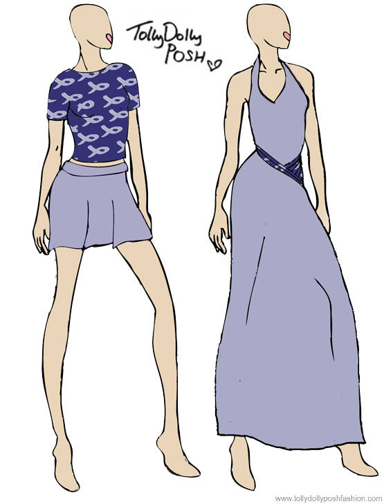
talia joyKeep On Swimming Print Top & Lilac Skater Skirt (Left) Lilac Maxi Skirt with Keep On Swimming Print Ruffle Detail (Right)
These designs are very basic, but I love them. I think the print is really cute and could be worn with most things. I’d like the top to be that in between length of cropped and not cropped. The skirt would be a nice ‘thick but thin’ cotton jersey material, in a lilac colour. The dress on the left again would be a ‘thick but thin’ stretchy material, with a printed ruffle detailing. The neck would be haltered with a tie at the back.

talia joy 2

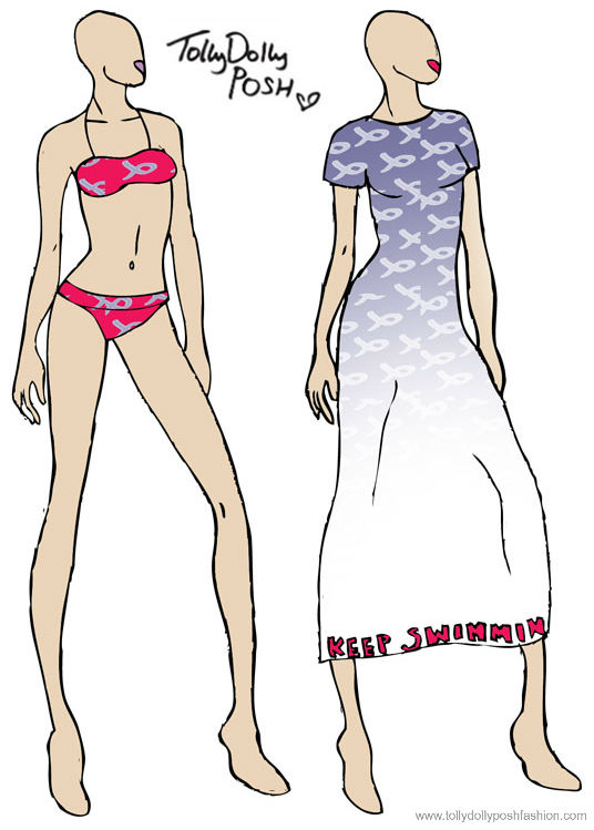
Keep On Swimming Pink Print Bikini Top & Bottoms (Left) Keep On Swimming Ombre Maxi Dress with ‘Keep Swimmin’ in Bright Pink (Right)

Again, this bikini and bottoms would be very simple, with the same print but in a pink colour. The neck would be clasped at the back and the bottoms would be more of a boxer shape so they are more comfortable. The dress on the right would be quite loose fitting, but not baggy. It has an ombre print from blue to white, with ‘Keep Swimmin’ at the very bottom so it pokes through now and again. I think this dress would look great with a leather jacket.

So, as I said at the beginning there is a meaning behind these designs. It’s a sad and happy story, so here we go: A young girl called Talia Joy Castellano, age 13, just like me, has recently lost her fight against cancer. You maybe thinking, well, why do you care? The reason is, is because, again just like me, she was a blogger, a YouTuber to be precise. Talia fought her battle for 6 years, and was and still we be an inspiration. She touched many hearts and was a very strong human being. Before she passed away a couple of days ago, I was following her updates, and one of them was a request for people to complete things on Talia’s bucketlist.

Some of these things included, having a cake fight, and covering a car in post it notes. Many of the things are things which most people would take for granted and think were ordinary things young children do. One of the things was to create a clothing range, and it made me really want to do something. Obviously I can’t just go out and make hundreds of dresses but if I could have, I would have. So, that is why I showing you these drawings I did. The reason for the name, is because Talia used to say ‘Keep On Swimming’, so I thought it would be a nice way to keep her inspiring story part of the ‘collection’.

I hope one day that I can produce this collection and that everyone who wears it remembers the true inspiration of which is Talia Joy. Although she may not be here now, she will be in a perfect peaceful place. Seeing as Talia and many other children my age go through these terrible times, I am going to be a lot more grateful from now on, because my life could be turned upside down within moments.

Along the same lines, I have decided to donate my August & September ad space money to Children In Need, so if you’d like to advertise in these months, it won’t go to me, it will go to somebody like Talia. You can see prices here.

You Might Also Like