
For today’s Scrap Social, I wanted to do something a little different… if you are into fashion design, or you are interested in starting on that path, one of the important stages in bringing a collection together is research. I researched a whole heck of a lot for my sock collection and I’m researching a whole heck of a lot for my current ART & Design project which is a collection based around the great Italian renaissance painters, Giotto and Pietro Lorenzetti, and more specifically, their work in the Basilica S. Francesco in Assisi. But what is fashion design research all about? Well, let’s dive in…
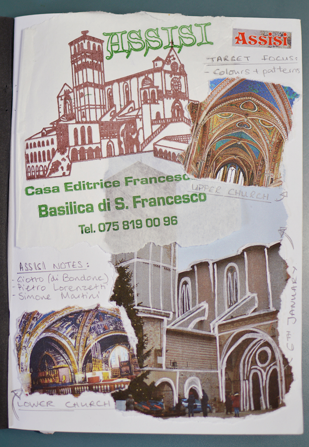
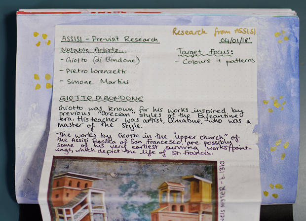
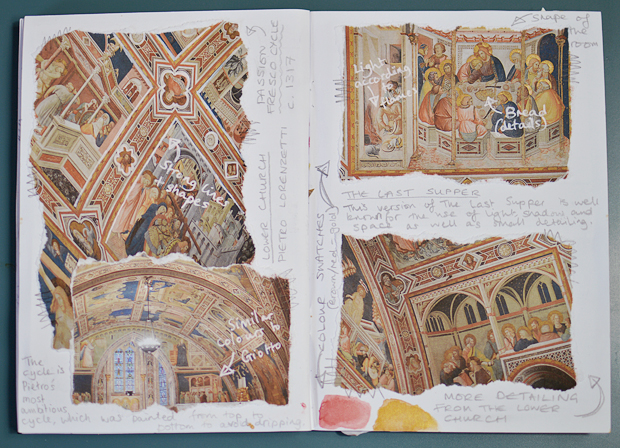
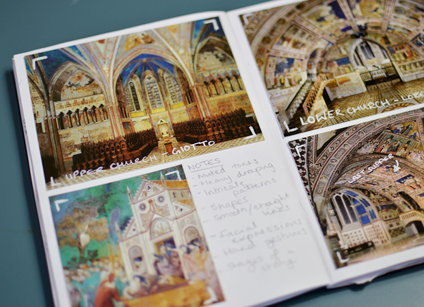
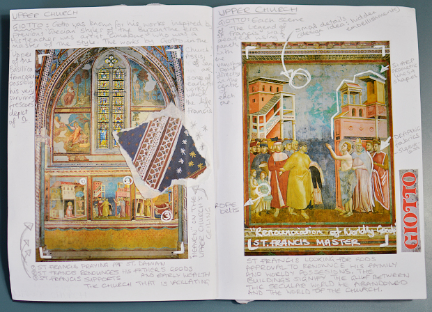
If you don’t know much about Assisi then this might not be of much interest, but the Basilica of San Francesco is one of the main places to go for renaissance art. It’s split into two sections; the Upper Church and the Lower Church. The Upper Church is home to some of Giotto di Bondone’s most well known works, as well as some of his earliest, with the Lower Church being home to some of Pietro Lorenzetti’s greatest pieces.
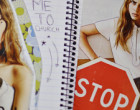
Before I visited, I did a little bit of research, mainly using one of the most detailed books I own (A New History of Italian Renaissance Art) to gain some knowledge. It really is quite incredible when you look at pictures in a book and then go and see the real thing, especially when it’s something so vast. An important thing to take note with research is that it doesn’t need to be perfect… it’s basically just a more specific, in depth version of a scrapbook, so having rough notes and scribbles actually adds to the whole effect.
Another important note about research is that people love to see your own pictures and art work. It’s fine to use pictures that you’ve found online, but honestly, your work will improve one hundred times over if you start to use your own work. Go out and experience what you’re learning about. I know not everyone can travel to Italy, but if you live near museums and galleries; go to them and use your own mind. This is your research after all.
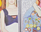
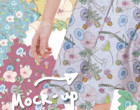
On the flip side of that, you can totally use postcards and photographs from a gift shop… because that’s still something you went out and personally purchased. As you can (hopefully) see above (and in the next few images), I collected a few postcards and prints to bulk up my scrapbook… adding notes and captions when necessary.
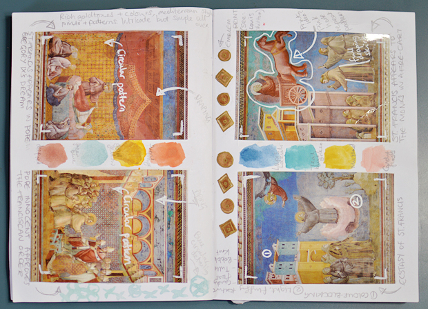
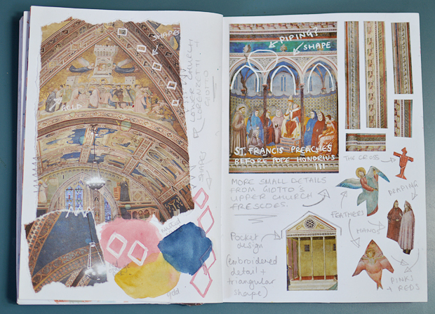
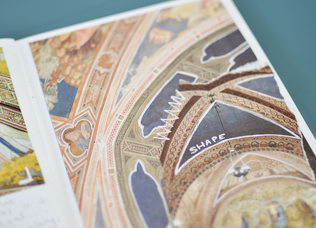
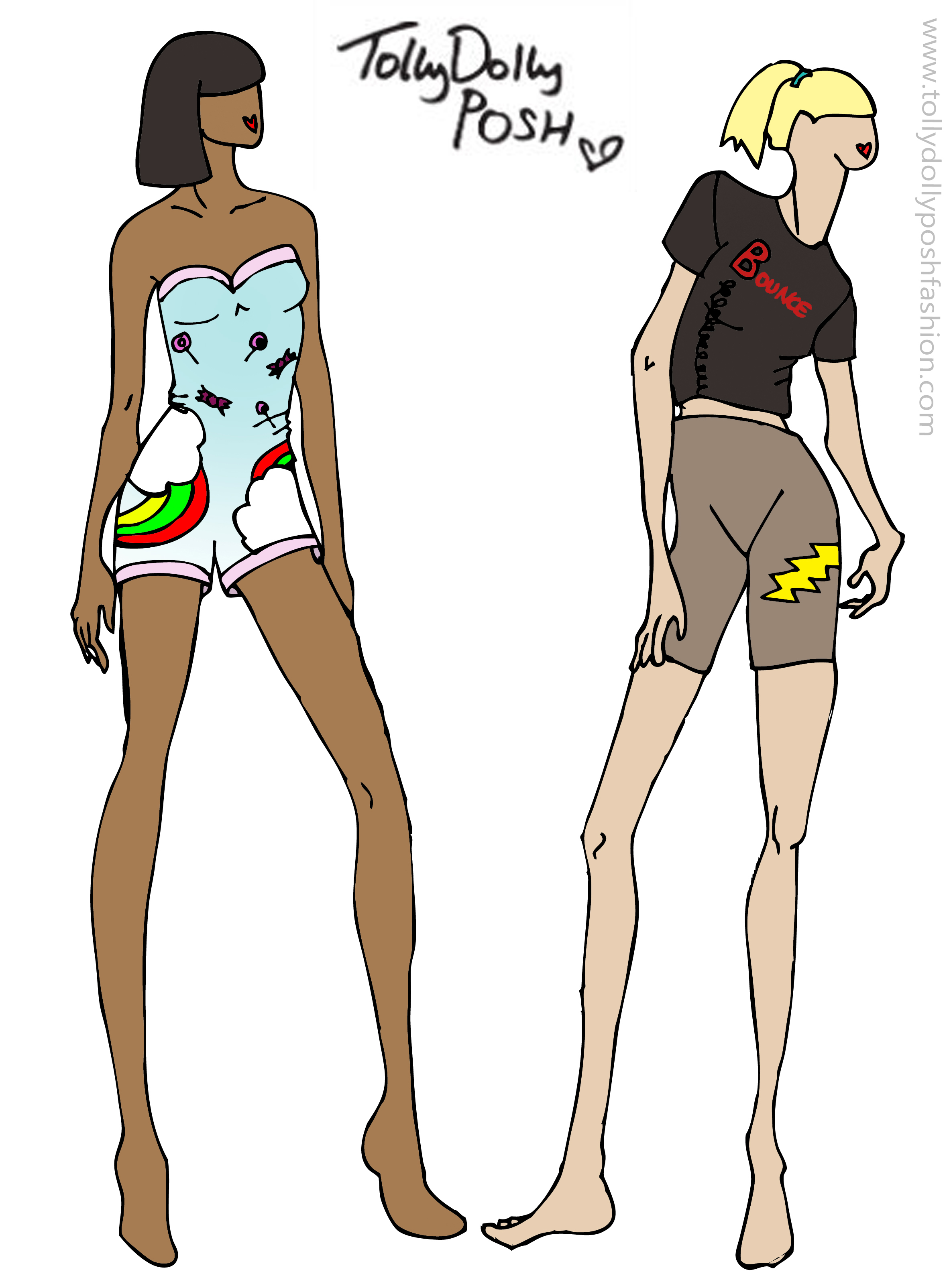
For both the Upper and Lower church, I decided I wanted to focus on shape and colour because they both have beautiful examples of this. Giotto’s colour palette is one of my favourite things about the whole church – it’s a fairly simple collection of colours in rather pastel shades, but they bring just the right amount of depth and can still work in the darker scenes.
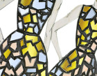
Lorenzetti is a better example of shape, especially when it comes to how he used the actual architecture of the Lower church. Every surface and curve is covered with the most beautiful, intricate shapes and patterns, which I was in awe of. Taking elements from both and thinking up how I could incorporate them into designs is always quite fun.
![]()
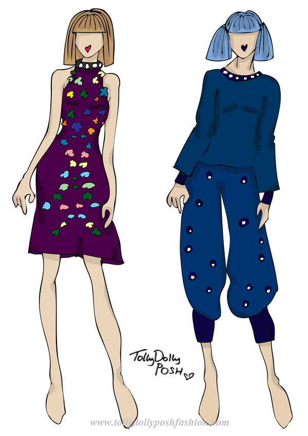
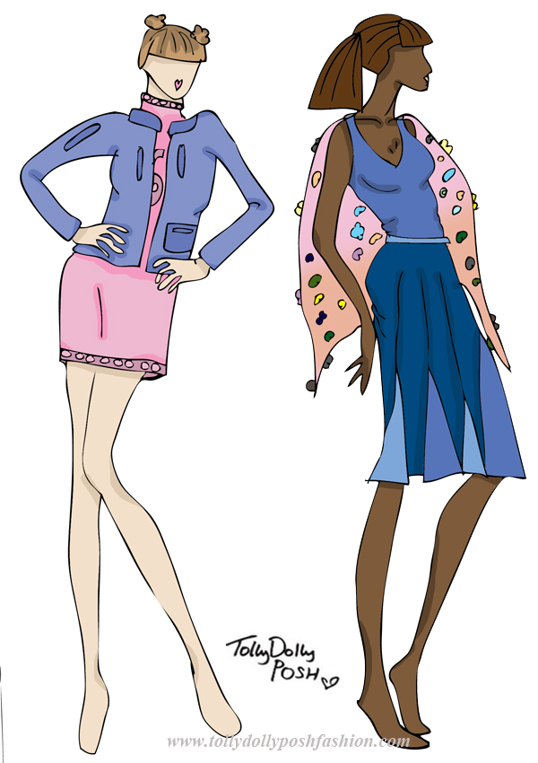
WHAT I USED:
White POSCA PC-1MR Pen ✏
Pilot Super Color Extra Fine Gold Pen ✏
Winsor & Newtown Watercolour Paints 🎨
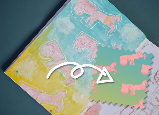
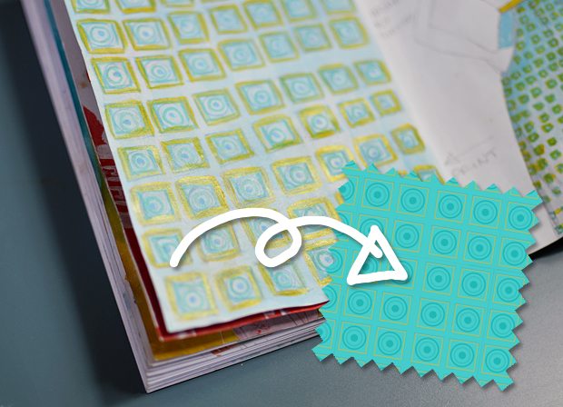
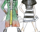
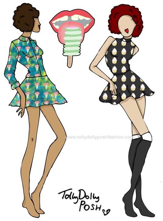
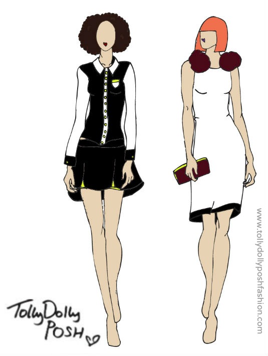
I thought I’d give you a quick glimpse to some patterns from a quick rough idea to a final piece. I’m still learning on making my repeat patterns perfect (digitally that is), but I’m pretty happy with the ones I did come up with. The pink horse is inspired by a piece by Giotto which involves a fire cart. I loved how it looked and how striking it could be, even in a pastel, “typically girly” shade.
I also added a quick list there for you, so you can see what pens and paints I used through out the whole book. I’m honestly obsessed with outlining things in white, and I love a bit of gold.
I hope you liked this little insight to my research! Let me know what you thought…


